Four Great Brand Examples From Recent Times
Co-authored By Siegel+Gale’s
Philip Davies – President EMEA
Zouheir Zoueihed – Managing Director, Middle East
James Withey – Executive Director
Sophie Lutman – Executive Creative Director

Philip Davies 
James Withey 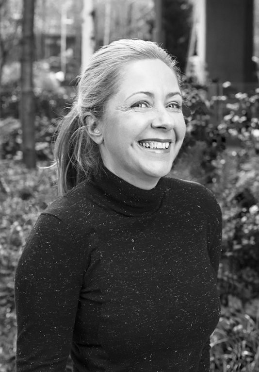
Sophie Lutman 
Zouheir Zoueihed
Our industry is full of incredibly skilled and passionate people. We consistently see great new work that sets the bar higher for us all. We feel it’s important to be able to recognise good work when we see it regardless of who did it. So, we wanted to celebrate four pieces of great brand work from recent times that were not created by us. Our EMEA Executive team have each picked a personal favourite.
The Netherlands! Simple and smart. Philip Davies, President, EMEA
At first glance, the rebranding for the Netherlands looks scant and basic – but it’s packed with intent and meaning.
Just like Rutger Bregman – the maverick Dutch historian best known for upsetting the 0.1 percenters’ cordiality last year in Davos – it’s blunt and bright and unapologetic.
As any strong brand should, it contains some bold and precise discernible assets, born from some smart and well-aimed decisions.
Let’s start with the name. It’s taken a long time but with this rebrand, the confusion over being Holland or the Netherlands can finally start to end.
There’s the tulip. Many images spring to mind; windmills, cheese markets, wooden shoes, canals, masterpieces of Old Masters, Delft Blue earthenware, liquorice, innovative water-management and millions of bicycles. But it’s still a tulip – no need to mess with a known property.
Only this time the tulip has been neatly contained within an N and L, letters introduced to further emphasise the Netherlands name clarification.
And then there’s the colour. There’s only one colour. And what a colour. Directly linking the nation with their royal ancestry but as bright and democratic as colour can get.
These three assets make this nation branding solution from Studio Dunbar particularly elegant and easy to apply to initiatives ranging from tourism, enterprise, culture and society. Instantly recognisable. Immediately understood. Impact guaranteed.
The overall impression is simple yet rich and plays as a perfect vehicle for the nation to showcase their direct and expressive nature, where beauty and originality and tolerance are fated and where creativity and ingenuity is expected, whether it be from the brilliant vans Gogh, Basten, Rossum, Houten and Halen or from super women Mata Hari, Anne Frank and movie superhero Famke Janssen.
It’s the Netherlands, just as we know it.
Studio Republik – Locally grown, globally fit. Zouheir Zoueihed, Managing Director, Middle East
FitRepublik, a world class sports and wellness centre and platform, opened its doors in 2015 in Dubai Sports City. Boasting state of the art facilities, this “one-stop shop for everything” as described by co-founder Ali El Amine, provides an extensive range of activities for people of all ages, who are looking to improve their fitness and wellbeing, with a passionate community of fitness experts and hobbyists. It represents the democratisation of sports and fitness, by giving power to the people.
While other organisations such as Fitness First or Flywheel typically invest in growth to cover as many physical locations as possible, FitRepublik sought to grow its brand story alongside its subscriptions, resulting in a steady increase in brand loyalty. This was reflected in the launch of StudioRepublik in 2020, a brand that still embodies the original philosophy of giving power to the people, but expanding its focus to include group exercise, preforming arts, such as drama, music and dance, as well as integrated wellness through nutrition, rehab, and strength & conditioning.
StudioRepublik’s unique positioning maintains its established heritage and differentiates it from the other organisations though the stylish experience of the physical brand in the heart of Dubai on Sheikh Zayed Road. Beginning on the approach to reception, its environment and interiors indulge customers, clearly setting the brand apart from others in the industry.
Over many years, myriad global brands have attempted to crack the Middle Eastern markets with varying degrees of localisation and adaptation. Few have succeeded beyond the position of an expat brand. It appears, however, that now the time is ripe for home-grown brands from the UAE and the wider region, to start-up locally; to grow and flex, and develop into truly global brands founded on operating and delivering a local experience.
Mixcloud: Connecting Audience And Artists. James Withey, Executive Director
Mixcloud mixes it with Spotify and Apple Music – brands with the resources to make a lot of noise.
With finite resources, Mixcloud needs to dial up how it differs. And its’ recent refresh does exactly that.
Great brands are driven by a simple, singular idea that they can amplify across their entire experience. That’s doubly true of Mixcloud, which both figuratively and literally amplifies connection between artist and audience.
Mixcloud’s ambition to create deeper connections between artist and audience than other streaming platforms is reflected in a new ‘connector’ device. This multi-faceted dash is at one stroke a simple line and at another a doodle that draws out a soundwave, while always standing simply for connection.
As pragmatic as it is purposeful, the ‘connector’ creates a sense of cohesion across diverse, user-generated imagery, saving money while swerving stock photography. It’s a visual solution that echoes the sonic function of the brand.
Given we all consume more digital type than ever before, it’s curious that more brands don’t drive distinctiveness through typography. So it’s refreshing to see that the Mixcloud identity is effectively typography first, representing collaboration over consumption – something the deliberate clashing together of colours further dramatises.
Studio Output’s work for Mixcloud is simple, smart and purposeful. It gets what makes the brand different and how it works and captures that, loud and clear.
The Mental Health Coalition: Repositioning Mental Health. Sophie Lutman, Executive Creative Director
Mental health has long been a taboo subject. Yet an estimated one in four people will be affected within their lifetime according to the World Health Organization. With a desire to destigmatise the topic, The Mental Health Coalition sought not only to create a brand for the organisation, but to rebrand mental health entirely.
This has been achieved through the use of a simple, powerful visual metaphor – the square peg in a round hole. The meaning is colloquial, embedded in culture, and immediately recognisable. This is a brand design with a simple truth at its heart, telling a compelling visual story. It’s confident, not overstated, and doesn’t feel the need to explain a ‘clever’ idea.
The black text against the bold yellow background suggests optimism; the peg, a casting of light at the end of the tunnel. It’s an immediately classic design that concentrates on communicating over ‘looking a certain way’. It might not look like the latest trend, but will last longer for it.
It’s an important story to tell and the tone has the right mix of optimism about the future and a call to action to make that happen. It is simplicity in its truest form. An identity that is both iconic and creative, based on a single compelling truth