Overview
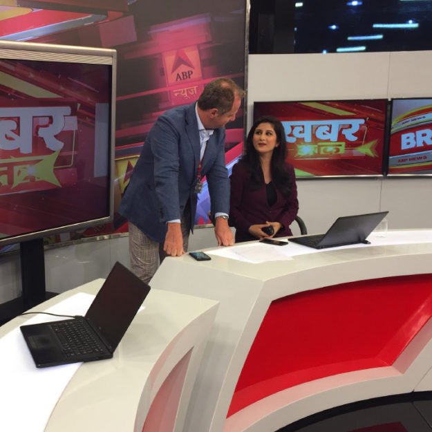
ABP Network is one of the largest media groups in India with millions of loyal viewers tuning in each day. Its long-standing flagship suite of news channels has expanded to all the main regions in the country and remains at the forefront of impartial information.
Saffron became ABP Network’s branding partner at an exciting moment of change for the organization. With a new CEO and impressive growth targets, the company was transforming from a news broadcaster to becoming a full-fledged media network.
The challenge was to increase the news channel’s reach in an overcrowded market, to create a story that could speak to the network’s new ambitions and to provide a brand that could act as a tool for their continued growth.
Positioning the Network for success
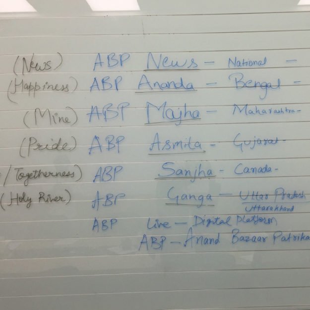
Previously the “ABP News Network” had been perceived synonymously with its news channels. Saffron detached the corporate brand, creating ABP Network and by doing so, gave it a sense of autonomy, allowing ABP as a network to pursue new verticals outside ‘news’. By showcasing the breadth of the network through this more agile architecture, the project opened the door for capital markets to understand the potential for India’s leading news network.
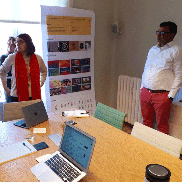
Saffron not only created a brand strategy for the the new ‘ABP Network’, but also provided a brand language designed to help them navigate the future. In order to support their growth into new channels, sub brands and even new verticals, the work provided a clear and functional brand architecture system. The new brand was designed to provide consistent direction with the powerful brand story centered around “creating an informed and open society”.
The foundations of ABP
Through primary research, interviews and observational work, Saffron discovered ABP’s deeply ingrained ambition: to create an informed and and therefore, open society. This vision was infused into everything the channels did and everyone at ABP played a vital role in delivering on it – the content decisions they made, the attitude of the anchors, and even the new businesses the network was now venturing into.
“We had very stimulating days with the Saffron team in creating a clutter breaking design which could make ABP Network avant-garde of Indian news broadcasting and beyond.”
Rama Paul, CHIEF MARKETING OFFICER
Bold Storytellers
After interviewing at length many of the regional news anchors and using ethnographic research to understand viewer archetypes, it became evident that the brand personality that connected the ABP Network spirit could be summarised through the phrase ‘Bold Storytellers’. Despite the impressive range of presenting styles across the network, what we picked up on was an innate boldness that allowed ABP to stand out from their competitors. To elucidate on their culture of informative news, documentary and commentary the idea of ‘storytelling’ is central to the products they create.
Typographic opportunity
With many different cultures, languages and scripts across India, typography proved to be both a challenge and an opportunity. It became a pivotal element in the brand toolkit and a key ingredient in bringing ‘bold storytellers’ to life. Utilising Noto Sans not only allowed ABP to create visual uniformity across all of its channels and languages but also provided a typeface that would support any future growth. This was supported by custom logo scripts created with support from Dr. Fiona Ross and type designer Neelakash Kshetrimayum. This process allowed the logo scripts to not only be technically accurate but capture the unique personality of each language while being optimised for onscreen and aligning to the ABP brand.
Freeing the arrow
One of the main focuses of this branding project was to create a brand that ABP could leverage as they looked towards the future. As one of India’s most forward-thinking networks, it was imperative that the key touchpoints of the brand expressed this.
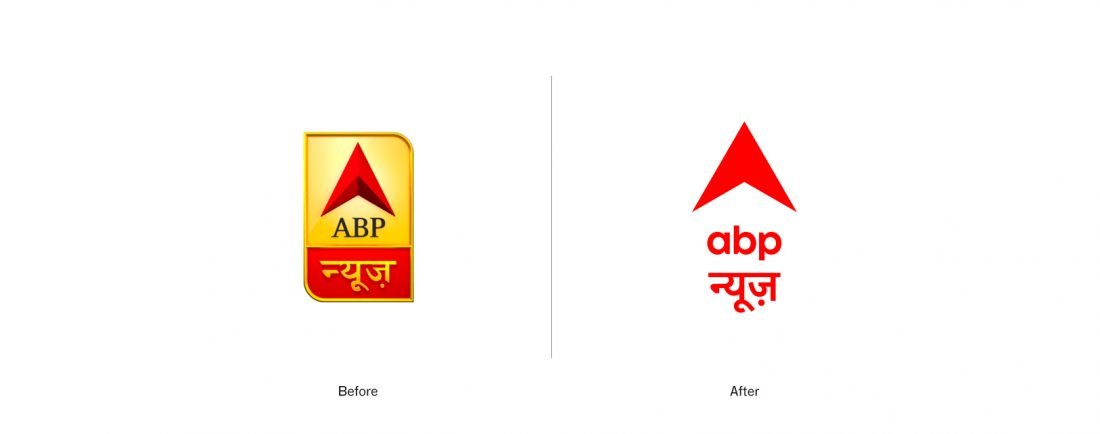
By ‘freeing’ the arrow from its box, ABP’s new endeavours have been metaphorically liberated perhaps reflecting the idea of an open society, free from dogma, and reflective of ABP’s brand purpose.
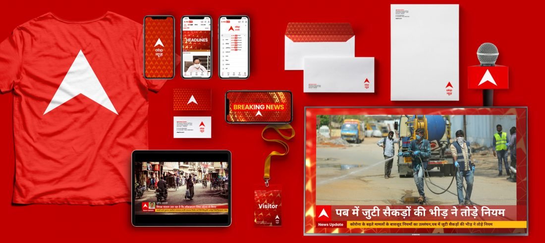
While the famous arrow still represents the brand’s heritage, it now adopts a behaviour that is more suited to digital environments such as the new mobile app. This change unlocks the potential to imagine a more motion led design befitting a TV broadcaster. The arrow has become an active asset, guiding the conversation with the viewers – unveiling insights and pointing out important information.
The fabric of Indian society
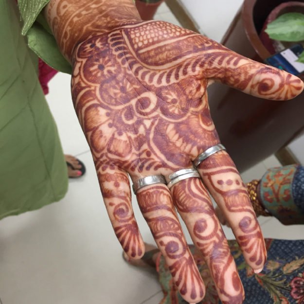
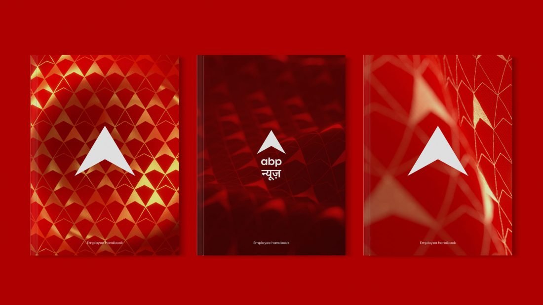
The beauty of ABP’s network was its affinity with the diverse cultures and regions of India, connecting with all its corners through the different channels. With ABP’s editorial style, renowned for its capillarity and flexibility to adapt to local nuances, it could genuinely claim to be the local reporter on a national scale. In response, Saffron created the notion of the ‘fabric of Indian society’ which led to a series of patterns inspired by the rich craft of textile design in India. Each pattern was built on the arrow geometry but changes subtly to reflect the personality of the regions whilst ensuring that they remain recognizable as part of the ABP brand.
A bold structure
By creating a refreshed on-air presence with a clear framework that can adapt and evolve to topics, genres and future news delivery, ABP can continue to expand, grow and reach new markets and regions.
Set for the future
The new brand framework and toolkit provides a foundation for the creative and individual expression for the multitude of shows and their personalities within the ABP News identity. This provides distinctive and personalised show openers that can still cohesively connect to the ABP visual language.
Today, ABP Network continues to expand to generate increasing value for its stakeholders and Indian society at large, delivering on the promise of creating an informed and open society.
