Rules For Good Logo Design, By The Brand Company’s Omar Hikal
Remember that your logo won’t make your brand iconic, your brand will make your logo iconic.
What makes a great logo?
One of the main visual brand assets that we enjoy developing for our clients is the logomark. Every company needs a way to quickly and easily communicate their brand, and the logo is usually the single element of a company’s visual identity that is called upon to achieve this.
In the brand development process, the creation of the logo has come to represent the moment when all the work that has gone into strategy and conceptual brand thinking is expected to be distilled into a single unique symbol or word mark. This usually burdens the designer with unrealistic expectations and often leads to a logo that, unfortunately, is no longer fit for the purpose of easily identifying a company or entity.
This is what I call “the logo paradox.” The expectation that a symbol that is most effective when it is simple, clear, and distinct should actually carry complex messaging and communicate many things about your brand. The logo paradox results in lengthy discussions about why the logo “doesn’t show integrity,” “isn’t human enough,” or “doesn’t communicate teamwork”, and ultimately leads to missed opportunities to find the logo that will actually achieve the main objectives.
At The Brand Company, we want to avoid falling into the trap of the logo paradox. We set out to design a logo that will be an effective symbol or word mark for your company. By no means will it be the only tool for brand expression or will it need to tell your entire brand story. There are many other communication and brand expression tools in our arsenal that will help us to ensure that your voice is heard and your story is told.

So what makes a great logo?
Your logo should be


Simple
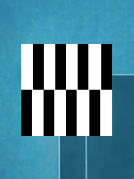
Most of the logos that are on our “wow, that’s a good logo!” lists are not complicated. They are clean and direct and they aren’t trying to do too much. When we think of the world’s iconic logos, which ones come to mind? Nike’s swoosh. Apple’s apple. Coca Cola’s iconic word mark.
We love distilling logos down to their most basic elements and structures. This approach often results in logos that look almost too simple, leaving the client thinking whether we put enough effort into it. The reality is that most of the time, simple is difficult!
Easily Recognizable
Ultimately, your logo has one job – to make your company or entity easily and consistently recognized at different touch points. That’s it. Your logo is a tool for identification. Your audience needs to see it, and instantly think of you (not another brand!).
Your logo is how you tell the world “I am here.” It is not a communication tool. It’s not a decorative tool. It’s not a personal reflection of what you believe. Very simply, it is meant to let people know that whatever they are experiencing – that’s you.
Fitting & Relevant
(contextual to the company, industry and strategy)
A very subtle yet critical element of every strong logo is its inherent appropriateness to the company and the industry. Often we see companies using logos that are not working for them – because they are out of context. Effective logos evoke the right initial impressions and emotions. A bakery and a tech company are trying to connect on a very different emotional level with their audience. A government entity and a food truck are not going to be using the same approach to logo design.
However, appropriate does not mean “same.” Brilliant logos have the courage to buck a certain trend. How can you use colors, typography, and design approach to differentiate your company from the competitors? If your industry is all about bold serif typography and dark colors, perhaps you want to go with a serif font with bold and bright colors?
Another dimension to consider is, if you are rebranding, what is the reason? What are you trying to signal? If your company has grown and is trying to appear as a market leader then make sure your logo (and visual identity) looks like that of a leader. Are you trying to reposition to be a more “green” company? Then you might need a logo that seems more natural and less industrial (but it doesn’t actually have to be green!).
Finally, your logo needs to be fitting and relevant to your future.
The last thing you want is for you to realize in two years that your logo looks outdated or that you have outgrown it.
Make sure that you are designing a logo that is appropriate for who you are today, but more importantly, for who you want to be tomorrow.
The Process
In order for the logo design process to deliver results that meet the above criteria and avoid some of the common pitfalls, the process needs to be clear and it needs to flow in a proper sequence from start to finish.
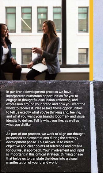
The creative process needs to be a collaboration between us and our client. The design phase
of the brand identity should be exciting and energetic, and the energy should be positive and aligned. In order to achieve this, we have some tips to help you be prepared to enjoy this important phase in your company’s journey.
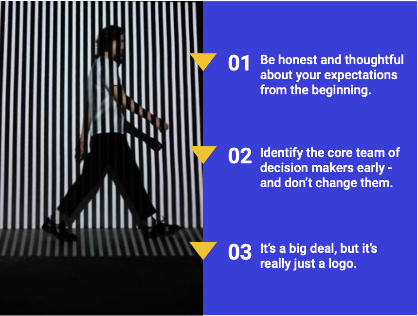
01
Be honest
and thoughtful about your expectations from the beginning.
02
Identify the core team of decision makers early – and don’t change them.
The brand development process is integrated and connected and starts with a deep-dive into the context, a brainstorming session and a series of strategic thinking exercises that ultimately result in your brand strategy. This work is essential for the subsequent step of designing your company’s logo and visual identity.
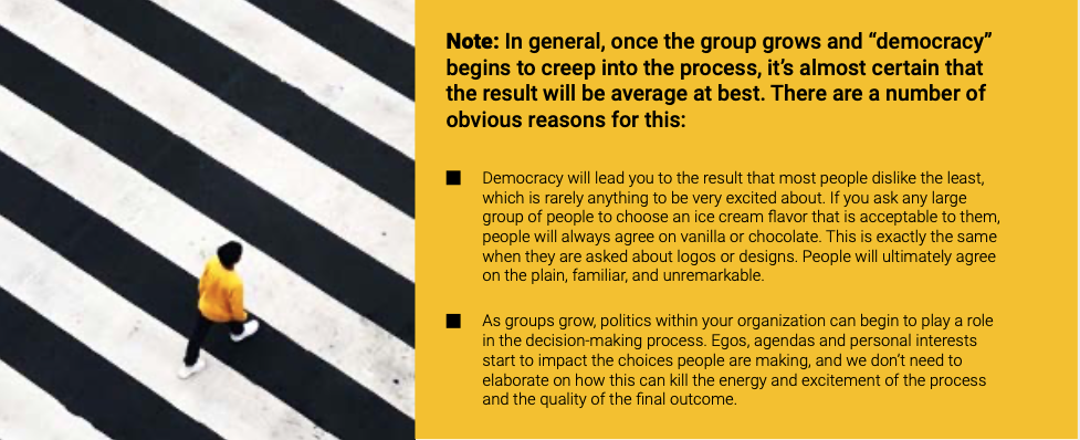
Anyone who is going to participate in the decision-making process needs to be aware of the strategic background and the objectives behind the designs. Introducing new decision makers who aren’t aware of the thinking and decisions that have come before will confuse the process, prolong it, and ultimately result in a mediocre outcome.
Asking random passers-by what they think of a new logomark design without explaining your strategy to them and sharing the complete visual solution does a great disservice to the process and to the final outcome.
Choose a maximum of six members of your team to be the core decision-makers when it comes to choosing a new logo and visual identity. If you want to involve a larger group to help you choose between two final options, then ensure that they have the proper context, understand the strategy and are clear on what the criteria for selection are. You don’t want this to turn into a battle of personal tastes and opinions that can easily end up derailing the process.
03
It’s a big deal, but it’s really just a logo.
We know that this is a big decision for you. A lot of time, effort and investment has been put into it by you, your team, and the agency, and you want the final outcome to be a work of art.
The truth is, some of the world’s most iconic logos are so simple as to be almost unnoticeable if it weren’t for the massive investments made to ensure that they became familiar around the globe. That simplicity is exactly what makes them iconic, not their elaborate artistry and complicated designs.
As we said above, designing a simple logo is far from easy. Sometimes, the hardest and most important part of the process is actually approving it.
Don’t expect your logo to solve all of your problems, and definitely don’t expect to see it hanging in the walls of the National Gallery or the Louvre anytime soon.
Your logo is a part of your brand’s visual arsenal that should instantly identify your brand to your audience. Once infused with meaning through communication and the consistent delivery of an exceptional experience, it will also inspire trust, confidence and pride.