Founded in 1927, Magrabi brings a history of medical excellence and optical finest care to the Middle East and North Africa. Recently, an intense competition in the retail optical market has emerged, pushing Magrabi to outperform in order to reclaim its historical position. Magrabi hired landor to revolutionize its optical retail brand experience. Just six months after launch, with a new marketing roadmap, Magrabi reaffirmed its position as a leader in the eye care category. Smashing sales records, it secured prime locations in the most prestigious malls in the Middle East and North Africa. Our Berries, US’ Alex Moulton of Trollbäck+Company and Egypt’s Taimour Othman of The Brand Bees, have reviewed the brand update.
Taimour Othman
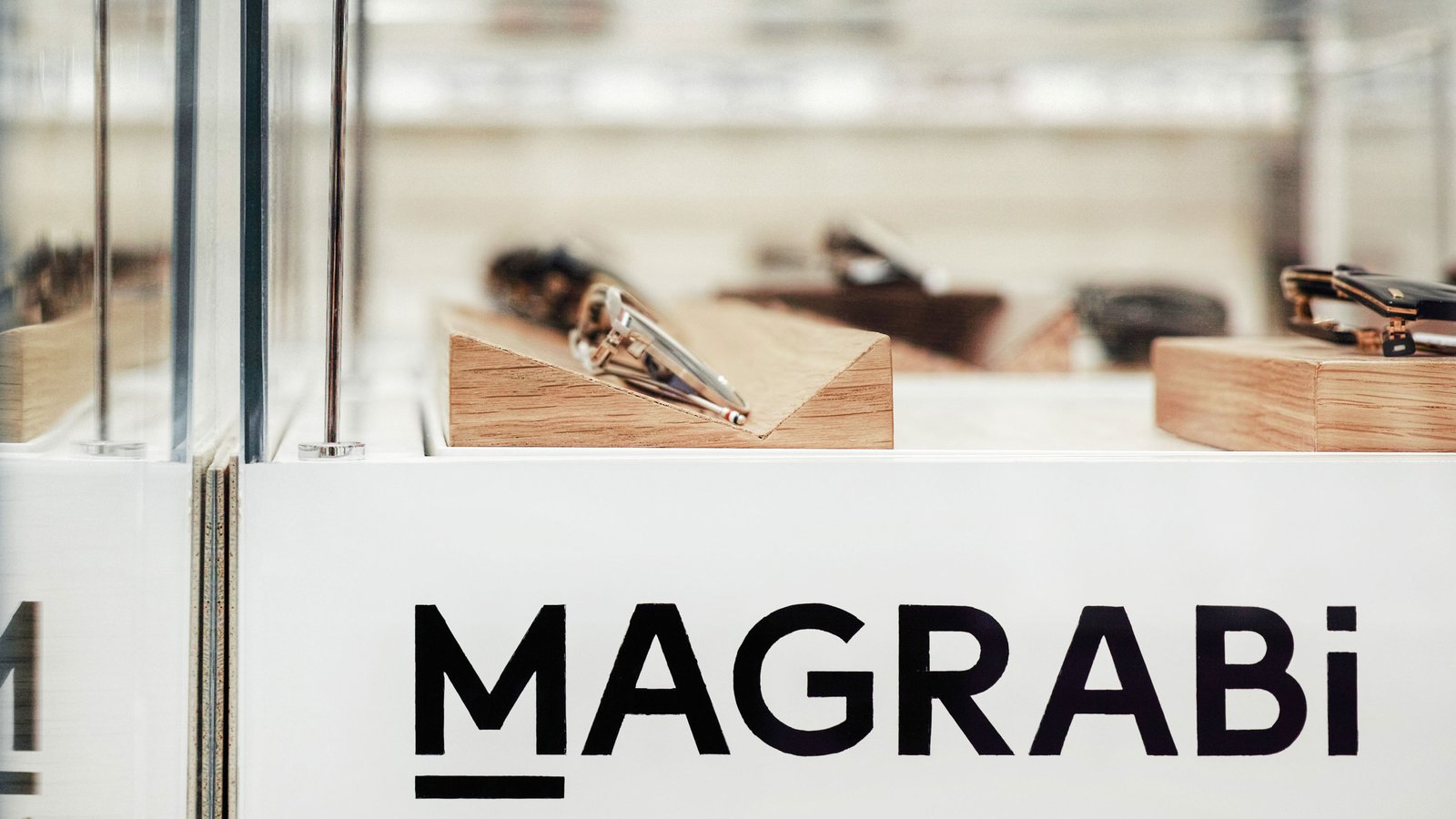
First off let’s start with the visual identity. The typeface feels basic rather than elegant, and it may be that they opted for the bold weight to offset this effect but it does not completely succeed. The addition of the line beneath the “M” to create an iconography looks uncannily like the line used beneath the 6 to distinguish it from the 9. If the aim is familiarity, based on the typical eyesight chart, they would have been better off taking a page from Joly Optics who succeeded at doing this in a much more subtle manner.
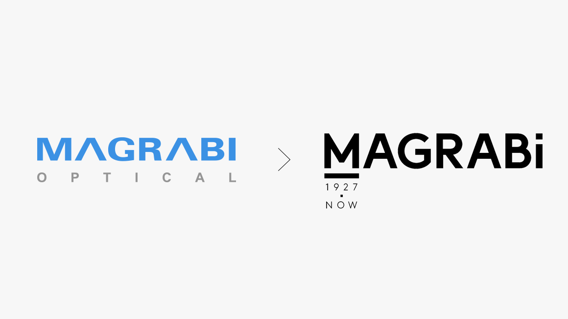
Moving on to the best part, changing the descriptor from “Since 1927” to “1927.Now” is both original and bold, changing the perspective from backward looking to forward looking with a simple reversal. Concluding on the visual identity, I believe it was an extremely safe choice top switch from blue to black – in a pool of choices for the consumer experience, they chose to be very objective and avoid adversely influencing the purchasing decision. Nevertheless, was the pale mint necessary? So to recap: The typeface: basic. The iconography: we’ve seen it before. The descriptor: smart and original. The colors: safe & potentially unnecessary.
So now, let’s move to the retail identity. I can stay here and talk about every aspect but I’ll save us all the time and effort and I’ll ask one simple question and please be honest with yourselves. Can you see anything that’s not been done before? At most you it may be the blend between fashion & medical, but again perhaps that’s enough.
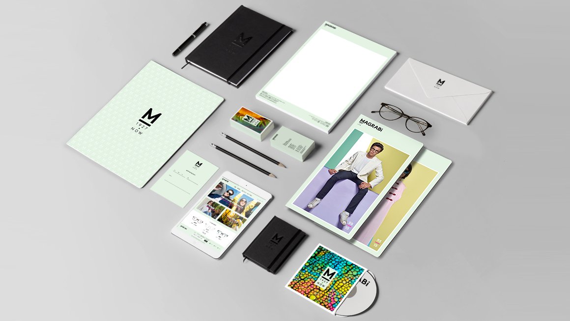
The new logotype is the first enormous step forward. It is clean, contemporary and legible, but even though it retains its width, it greatly increases its height and therefore, its impact. I’m certain that they were very happy to put the old logo in the past, where it should be kept locked away forever. I do question the need for the underscored “M” even when used as a graphic device to neatly lock up the date, simply because this trope feels unoriginal after being used by countless other brands. But the underscore seems very stylish and functional in relation to the lower-case “i,” which I can only interpret as a visual pun for “eye.” My heart goes out to the designer who was pushed to lower the case of that poor last letter, presumably to satisfy a request to make the logotype more meaningful. Which in my opinion it does not.
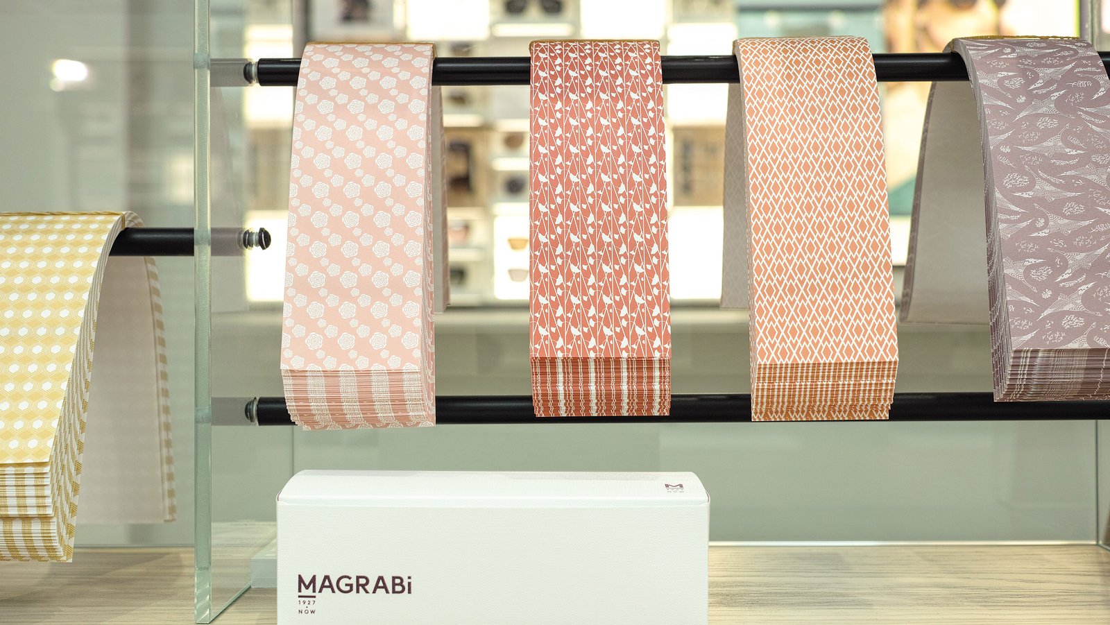
I love the brand color palette. The pale mint is at once refreshing, cool, inviting, and clinical, and is complimented beautifully by the monochrome logo and the bright palette of various photographic imagery. The use of subtle traditional decorative patterns and other textural elements very much deliver on the strategic brief. I’m a little unclear on how the conceit of “the frame,” as posited in the case study, is translated visually throughout the identity. Is the frame the underscore, or the combination of M and underscore? When does it frame content or messaging?
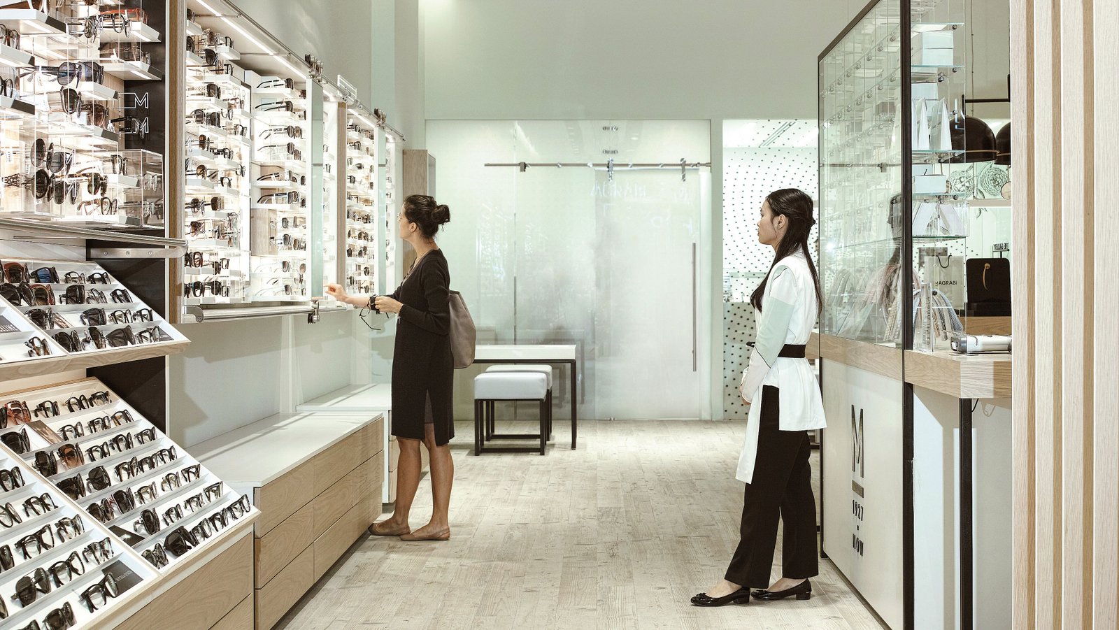
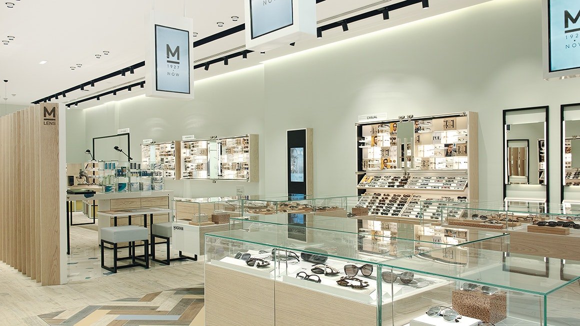
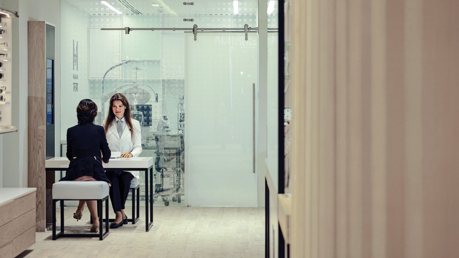
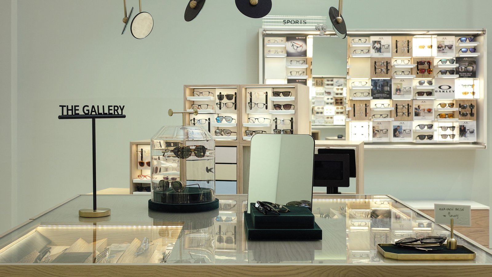
The translation of the static visual identity into the retail environment is seamless. The customer experience feels refined and balanced, with bespoke considerations that meaningfully bring together shoppers, staff, and product. The fashionable-yet-clinical staff uniforms are reminiscent of Kiehl’s, a New York City-based skin care retail brand operated by L’Oreal, where staff wear white doctor’s coats to telegraph a feeling of trust, experience and knowledge. But in this case, the execution of that aesthetic feels more considered and appropriate for Magrabi’s breadth of services.
With such a bold new visual identity, I wish that the website (not mentioned in the case study and likely not among Landor’s deliverables) was as fresh and consistent with the retail experience. Perhaps that is yet to come, since they’ve set a very high bar for themselves and certainly for competitors in creating a beautiful omnichannel brand design.