Introduction
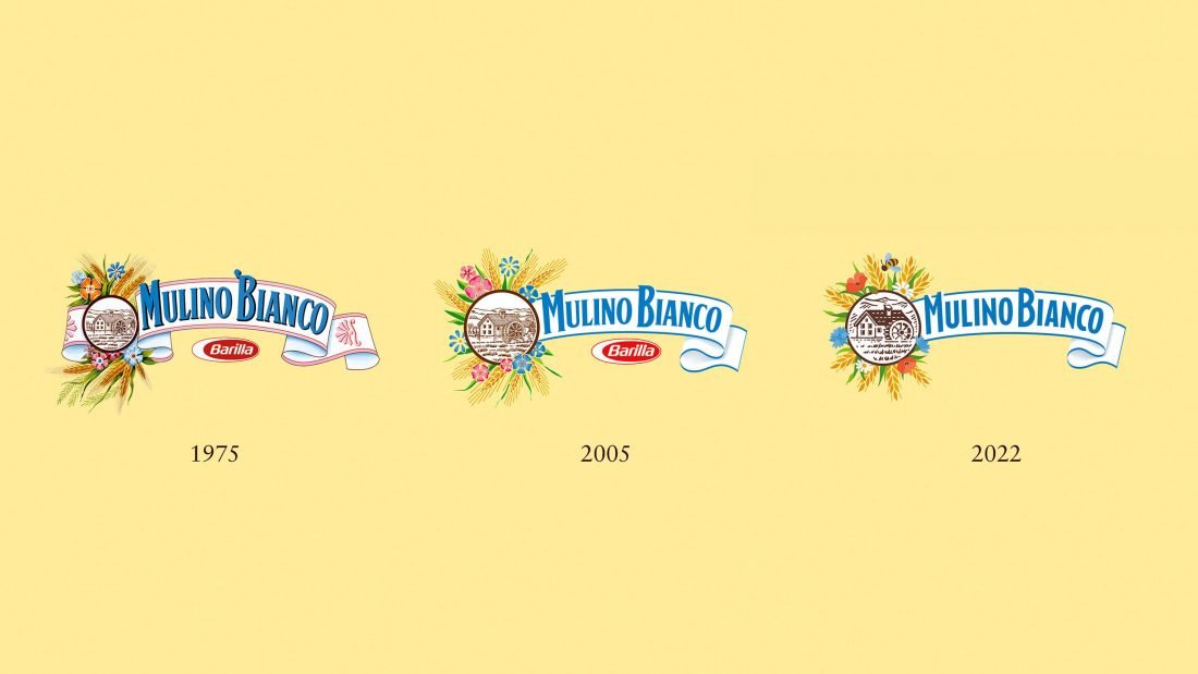
Only a few logotypes represent the brand purpose so powerfully as that of Mulino Bianco. It contains the whole history of the brand in miniature, a true icon that has been part of millions of Italian consumers’ lives over the last 50 years.
Challenge
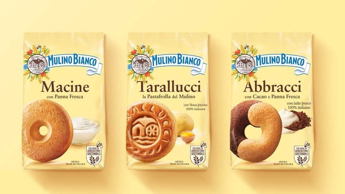
Over the years, the Mulino Bianco logo – designed in 1975 by Gio Rossi for Barilla – has evolved without diminishing its storytelling capacity. Today, the increasing efforts of Mulino Bianco towards a sustainable future required a further evolution to better represent the brand’s commitment to protecting the planet and its resources as stated in the “Mulino Bianco Sustainability Chart”.
Solution
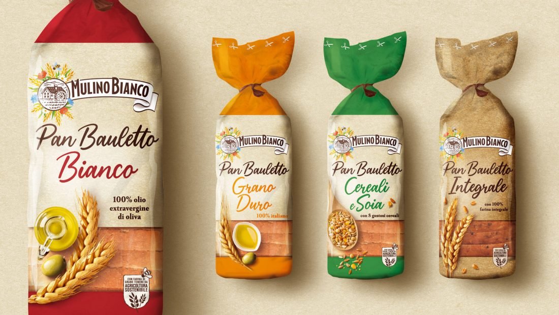
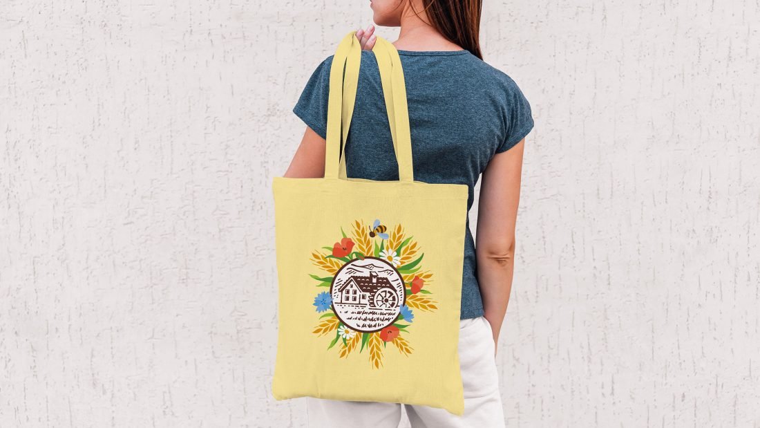
The iconic graphic elements of the Mulino Bianco logo – the flowers, the mill, the ears of corn – have evolved to describe a lively and authentic nature. FutureBrand represented the brand tension between simplicity and plentifulness, genuineness and contemporaneity to express the brand’s deepest soul which remains connected to its heritage while heading for the future.
Results
The rebranding of Mulino Bianco is not a mere simplification of the visual complexities, but rather the creation of a new story celebrating the brand’s holistic approach of integrating nature, the real one, in its everyday efforts towards goodness and genuineness.
“This is not a normal rebranding, first of all for the sentimental relevance of this very brand on the Italian market, and then because it is a way for us to celebrate the genius of Gio Rossi, the designer who first understood the importance of packaging design and applied it in Italy early in the 60s. FutureBrand Milan originated from Gio Rossi Associati and we couldn’t be prouder of it.”
Gianni Tozzi, Chief Creative Officer International