Imtenan is a Cairo-based Egyptian brand focused on the production and retail sale of nutritional and healthy products including natural foods, diet, energy, immunity and skin-care products, as well as nutritional supplements essential for various chronic medical conditions. Established in 1982, Imtenan kicked off as a premium quality honey brand. In 2005, Imtenan repositioned itself in the Egyptian market with the opening of its first flagship store that introduced the concept of a “Health Shop”. Reflecting the new brand essence, Imtenan has decided to introduce a brand new visual identity designed and developed by the Cairo-based brand consultancy, Matter Branding. Our Berries, Egypt’s Taimour Othman of The Brand Bees and US’ Lucien Etori of Salt Branding, have reviewed the project.
Taimour Othman
Ever since Imtenan was established, its founders had a vision to introduce the Egyptian market to the world of high quality organic food products. Like most Egyptian companies, their understanding of branding is limited to logo design or even label design – representing the tip of the iceberg and a long way from what a true brand strategy can deliver. In order to deliver on the promise of a real branding platform it takes the concerted efforts of a branding agency working side by side with the Marketing team, the group ultimately responsible for defining the firm’s vision for the marketplace.
At Imtenan, the team realized that their brand can be significantly more successful and impactful if the brand can effectively convey the quality of the products they produce. In that respect, they have a brand today that more closely syncs with their values and represents a step change from their previous brands – and the creators of this major revamp, Matter branding, should be duly recognized for this outstanding achievement.
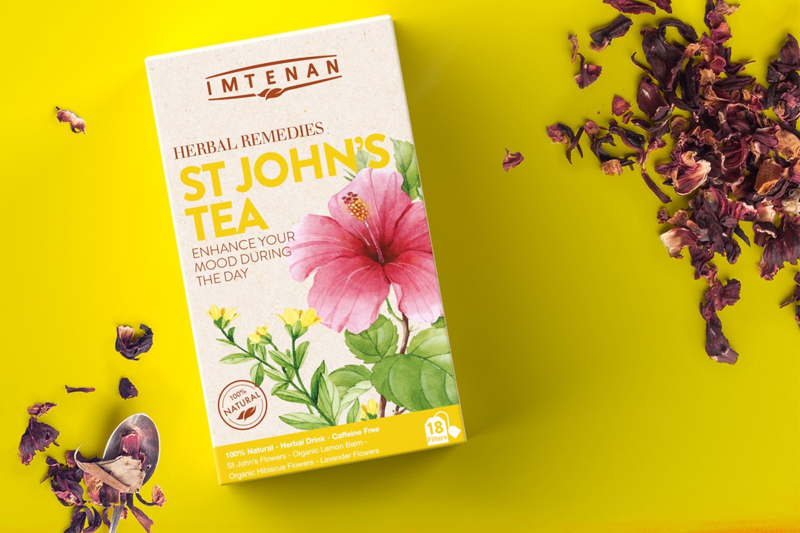
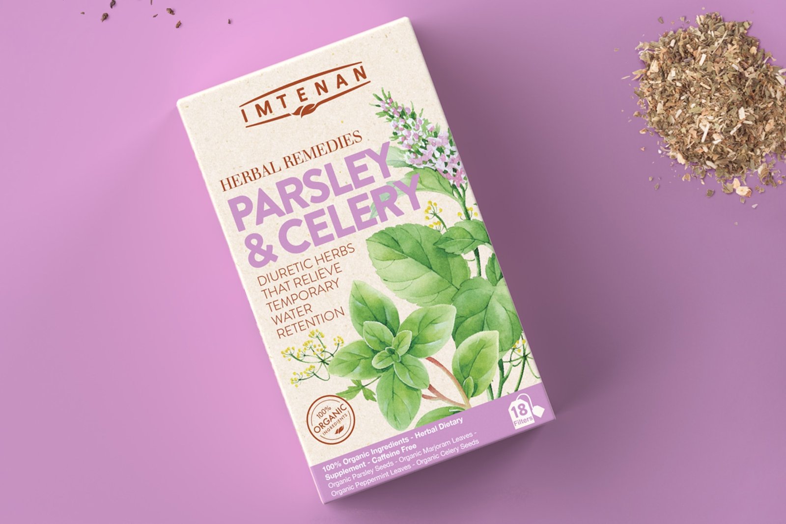
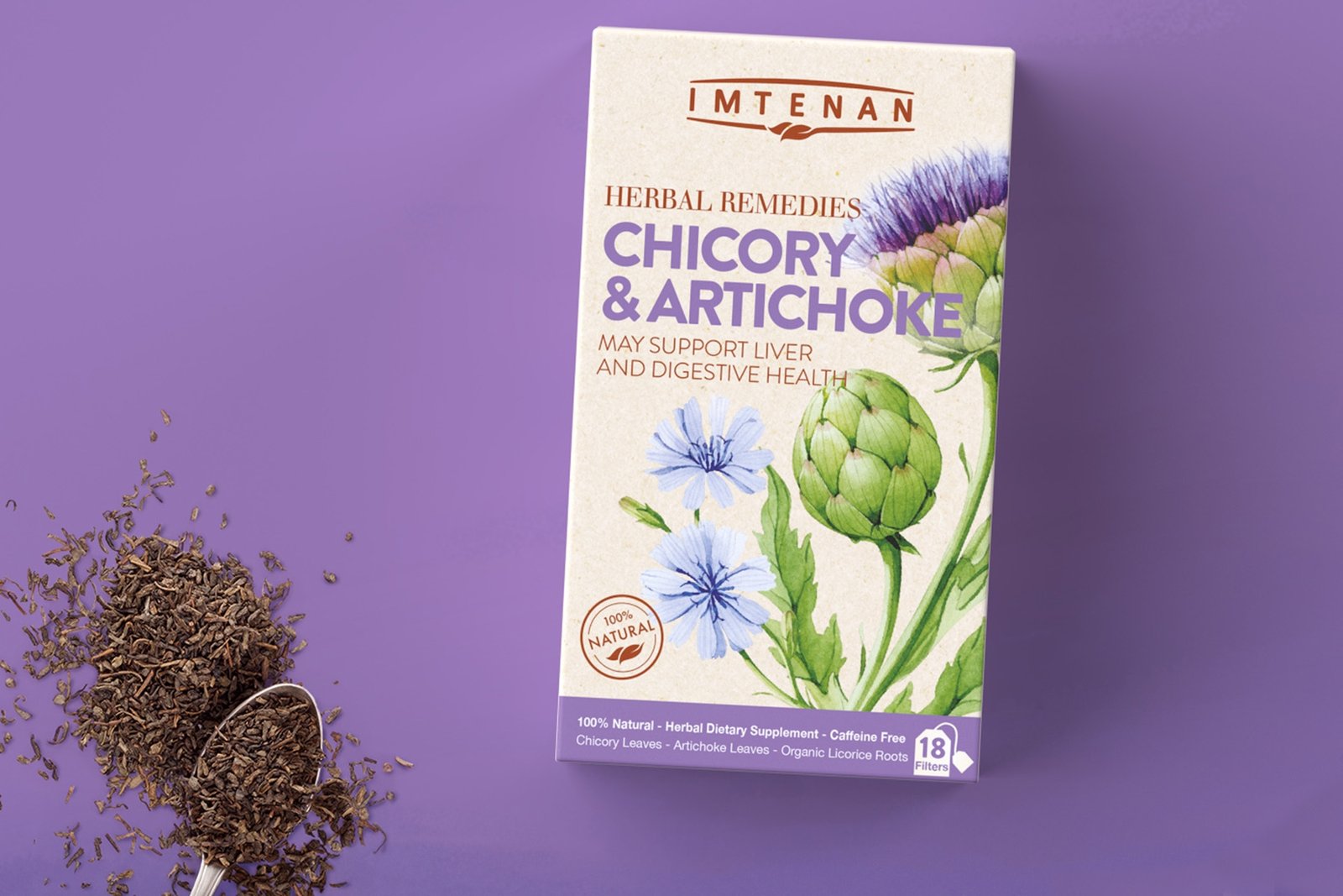
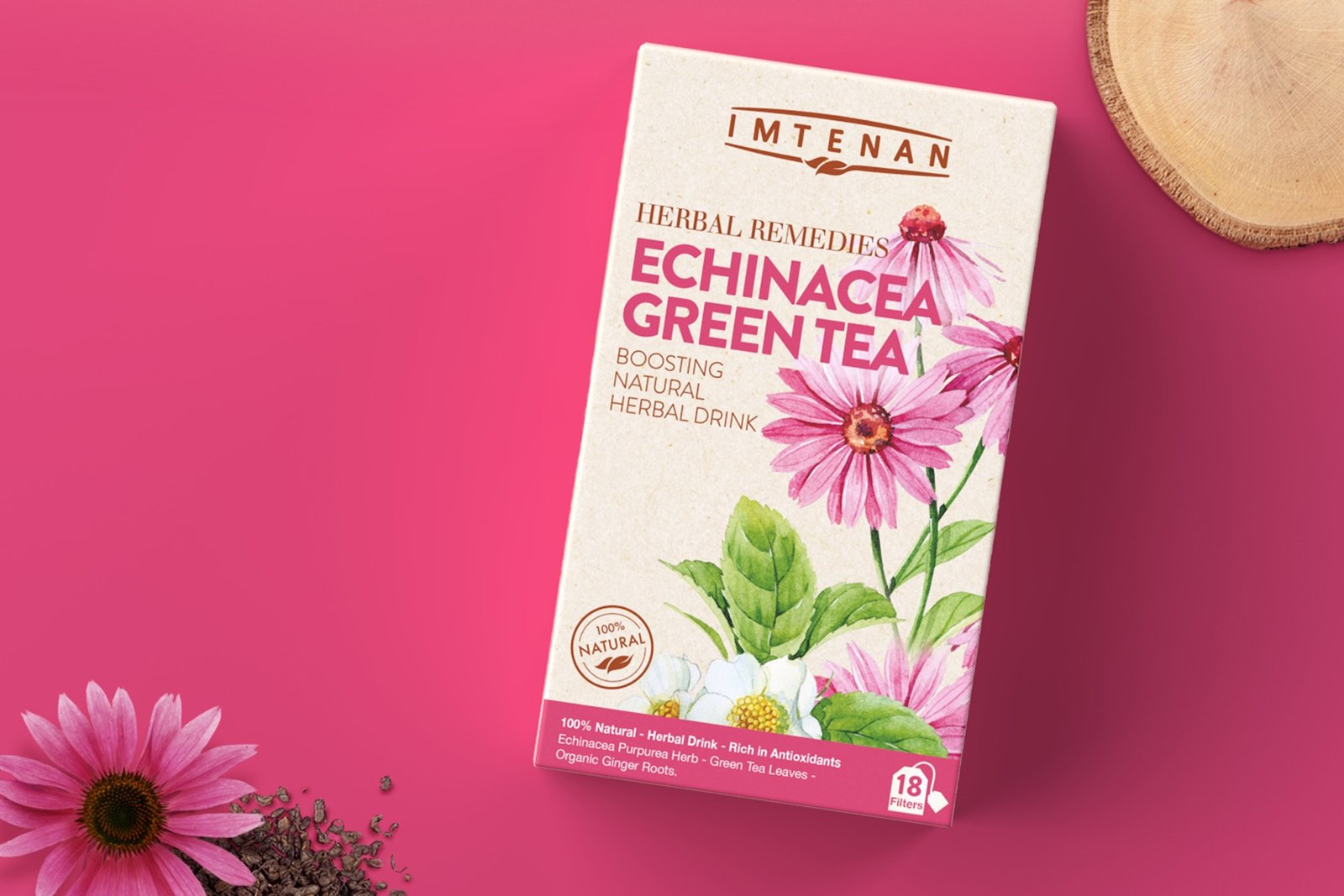
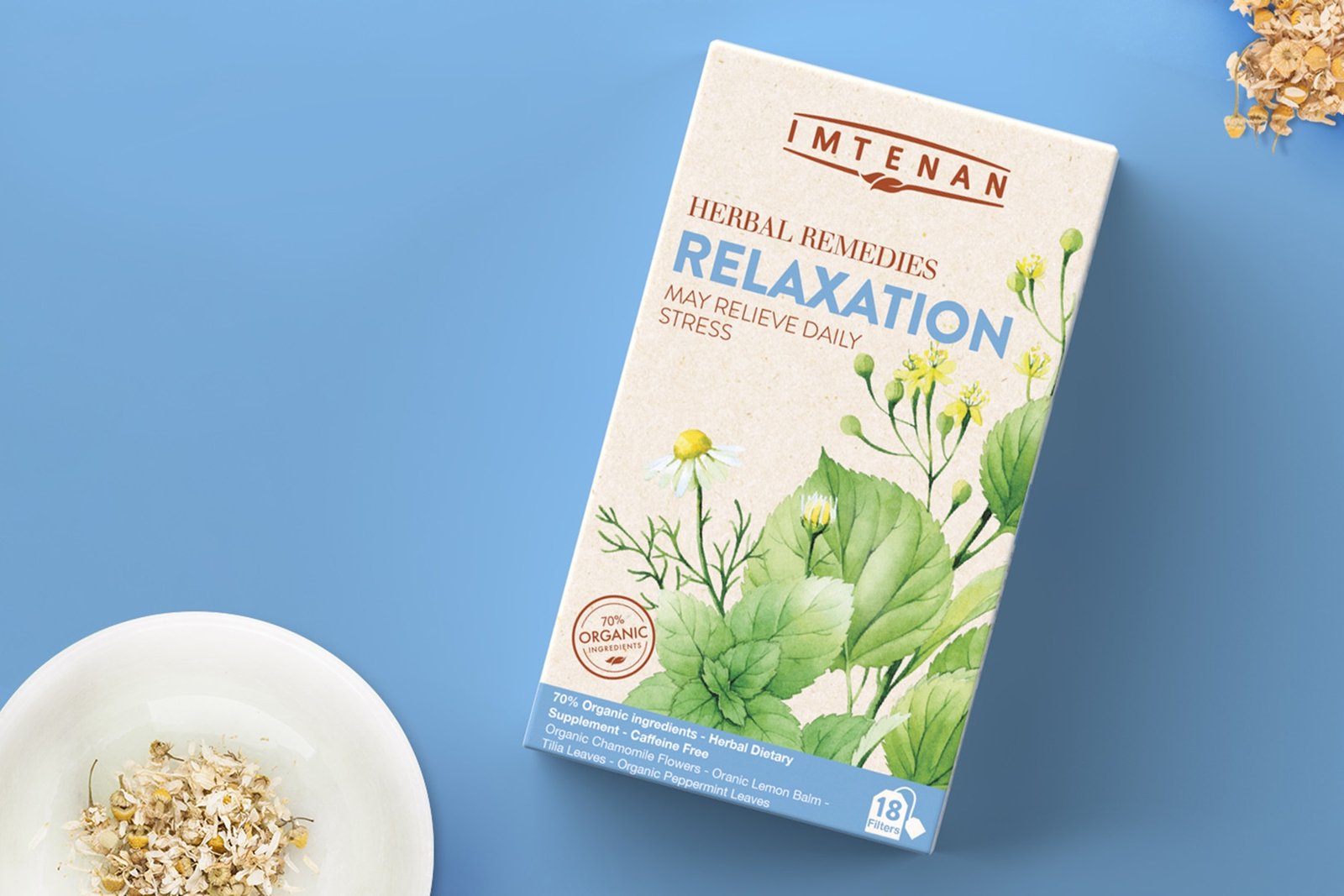
If we look at the brand in more technical terms, we start with the main company’s logo and the various steps taken starting with the simplification of the leaf, the drawing of lines above and below typeface that draws an invisible visual frame, and the use of a sans serif English font and its corresponding Arabic version, both timeless thereby avoiding any subjectivity regarding typeface and allowing the logo to be used easily across both their products and retail outlets without conflict. On the packaging, a successful skeleton of the brand was created that could be easily adopted across all the sub-brands for the different product categories – honey, health bars, powder, oils, soaps and even tea. In this was they could directly attract the target audience simply by being very “berry” clear about the nature of the product and its key benefits – with a simple look, the consumer can have a clear idea of what to expect. All this can be considered only the first layer. Digging deeper you will notice that they managed to use color palettes to reflect the nature of the product whether it was the tea with solid colored backgrounds, the oils with craft like textures to give the natural feel, the soaps and how organic they are, or even fitness & nutrition products with their black backgrounds to give that extra roughness the consumer is looking for. This all comes together with the visual style with its hand drawn water color that reflects the organic feel of the mother brand and also spills over to what Imtenan stands for and cascades across the whole array of sub-brands.
Imtenan’s story is a successful one that is beneficial to all local brands or corporations in order to learn from the steps Imtenan took and the level of investment needed to undergo such drastic image change. Well now we can proudly say this brand is “Made in Egypt” on a 360 level.

Lucien Etori
To start off by saying that the new identity is utterly, comprehensively, DRAMATICALLY better than the previous one and this at every level.When a brand wants to signal change it can choose to do so gradually, incrementally as to not lose some of their hard earned visual equity with the consumer, but the previous Imteman identity was so riotously untidy that a radical change was needed and Matter certainly did a wonderful job there.The brand now possesses a much more confident, assertive personality and feels altogether contemporized and far fresher, in keeping with a strategic positioning that centers around natural provenance/organic.
That said there are a couple of elements that gave me pause:
- The first is the spacing between the letters of the wordmark IMTENAN.It makes the brand name look much too wide/loose and thus a little awkward to read, especially when contrasted with the tighter kerning displayed on the packaging copy below.
- I’m also not certain the line drawings above and below said wordmark accomplish anything visually. They appear to be set too close to the wordmark, almost restraining it.
- The leaf symbols on the line below IMTENAN because of how small they are, don’t necessarily read well or quickly as leaves, making that line look more like a paintbrush.
I think here, doing away with line drawings above and below the wordmark entirely would have been an interesting option to see.The actual packaging is lovely, it’s got that craft paper-looking background/construction that works well to draw the eye and validates the ‘naturalness’ of the product. When the full range is lined up, it definitely packs a visual punch. The color palette is very nice and pleasing as well.
The water color illustrations I’m a little ambivalent about. On the one hand they are definitely eye catching but on the other hand, they feel a little anachronistic. Not retro enough and certainly not modern in their execution. They look a little like the flora you’d see on watercolor paintings in random middle-tier hotel rooms. And to to be honest many of the flowers look like they are wilting or not exactly brimming with vitality.The more significant issue with the front of the package, is that the overall presentation – and the sheer volume of copy – feels too decidedly busy and congested. Exacerbated by the multitude of fonts that are utilized.
The front of the package also raises a few questions, namely:
-The color coding at the bottom is a great idea but does it really help consumer choice at a glance? Why are Lactation and St John’s Tea the same color? If you have a product that is only for women wouldn’t it deserve it’s own color? The whole system does not feel elucidative or intuitive.
– Is the usage of ‘May’ i.e. ‘May support’ mandated by law? I’m assuming that is the reason for not simply stating “Supports Healthy Lactation” for example.
But overall, Matter did a wonderful job with the redesign here and I would be hardly surprised if their terrific efforts translate into highly positive consumer feedback and increased market share for the Imtenan brand in Egypt and beyond.