Bash, A Case Study By Mucho
TFG is South Africa’s top fashion and lifestyle retail group with 3k+ stores and 29 brands across Africa, the UK, and Australia. In late 2021, the Group embarked on a journey to become the leading omni-channel retailer in South Africa, by building a new digital platform that would not only embrace TFG’s fashion and lifestyle brands but a myriad of third party brands, products and services, all living under one integrated ecosystem. We assist them -from strategy to branding- in achieving this amazing adventure.
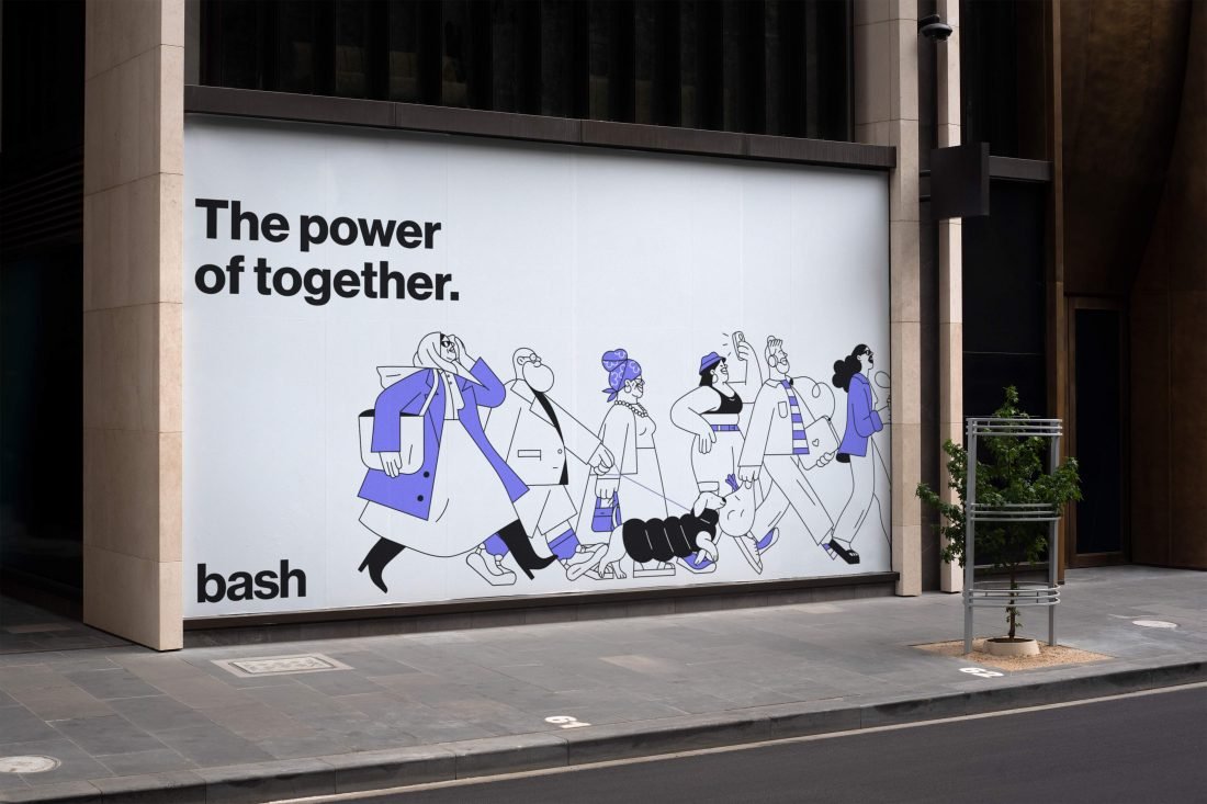
The Challenge
The Foschini Group (TFG) is South Africa’s leading fashion and lifestyle retail group, with more than 3k brick and mortar stores and a portfolio of 29 brands that speak to every generation, segment, taste and style, spanning Africa, the UK and Australia. Today, TFG houses both proprietary and independent global brands like Markham, G-Star Raw, @home or Totalsports.
In late 2021, the Group embarked on a journey to become the leading omni-channel retailer in South Africa, by building a new digital platform that would not only embrace TFG’s fashion and lifestyle brands—at the moment selling online through MyTFGWorld, the group’s e-commerce toolbox—but a myriad of third party brands, products and services, all living under one integrated ecosystem. A world-class digital team and one of the most innovative tech labs in Africa, TFG Labs, was born with the mandate of accelerating TFG’s digital strategy and the ambition to become the leading high-tech omni-channel retailer in South Africa. How? Building a new digital-native platform where not only shopping, but daily live’s moments and everyday choices would intersect.
One size does not fit all: a methodical process designed specifically for Bash
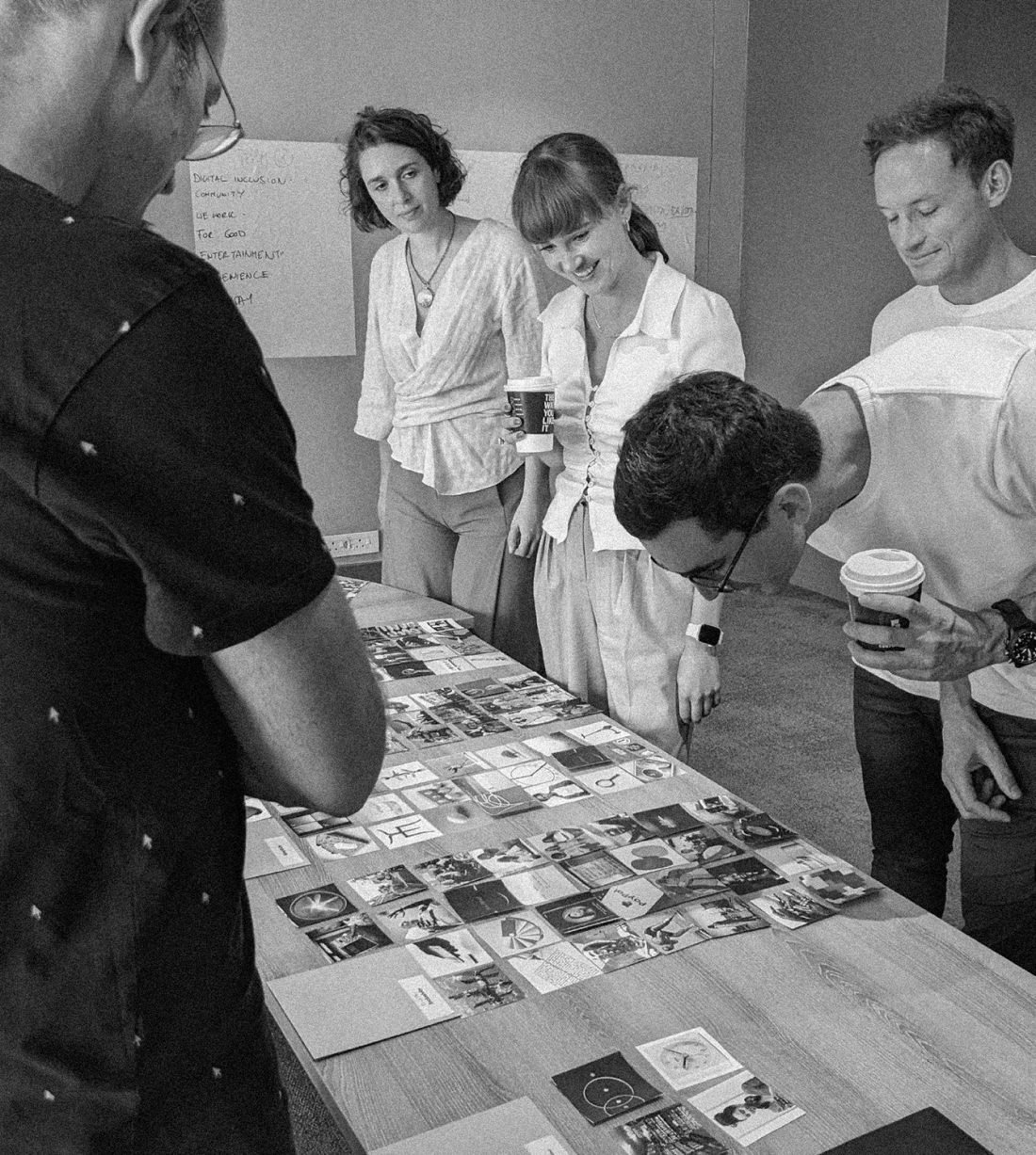
When Labs reached us to realize this vision, we designed a tailor-made process for the specific context and objectives of the project in collaboration with the team at TFG Labs and Relevance, our user research partner. A values-centric framework to align the brand, the company’s legacy and vision, and market and culture, merging insights from a comprehensive brand audit, competitive benchmarks and market research to define the new platform’s ideal DNA.
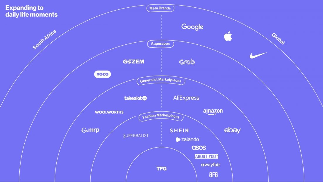
To start with, we dove deep into the technological context in Africa, where several waves had to be navigated at once. The African continent is living through a full speed development of e-commerce, fintech and the superapp race, while catching up with latest paradigm changes like robotics and the metaverse. A surge in connectivity and users craving for new and integrated digital services raised a great opportunity for this new platform.
The challenge, though, was not only technological but also competitive, as international brands and marketplaces like Zara or Amazon are entering the traditionally isolated African arena, disputing historical moats for local companies like TFG. At the same time, local players like Takealot are also moving fast towards more digitally integrated ecosystems.

We designed a tailor-made process for the specific context and objectives of the project in collaboration with the team at TFG Labs and Relevance, our user research partner.
Heritage and contemporaneity co-exist
Early on a new challenge emerged: the project was not only about digitally transforming the company but also about a cultural change. TFG, from a brand standpoint, could not do it all. Besides a new platform to evolve MyTFGWorld, a new brand was needed. Through several strategic workshops with the team at Labs we collectively designed a new brand architecture, where the TFG brand was elevated as a corporate powerhouse, serving independent retail brands, and the new platform would own and lead the omni-channel strategy.
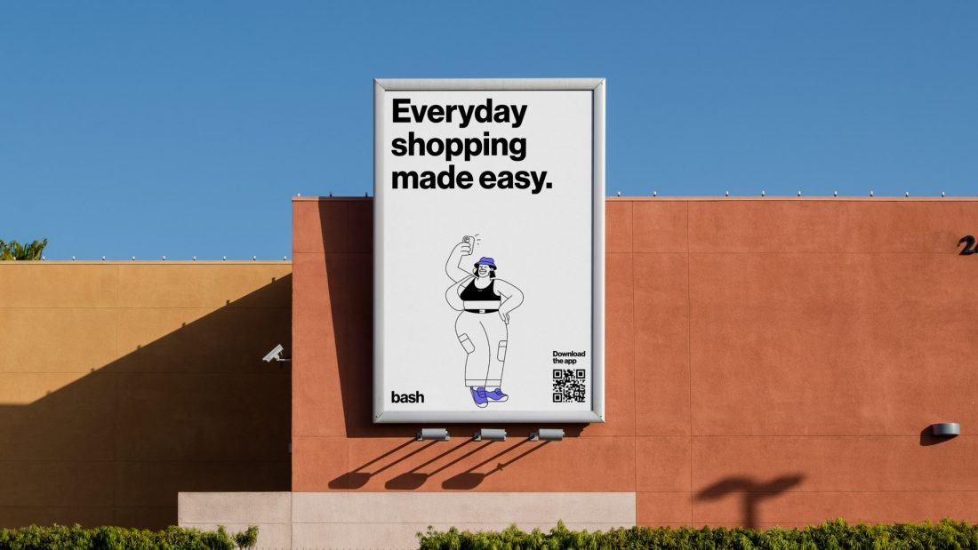
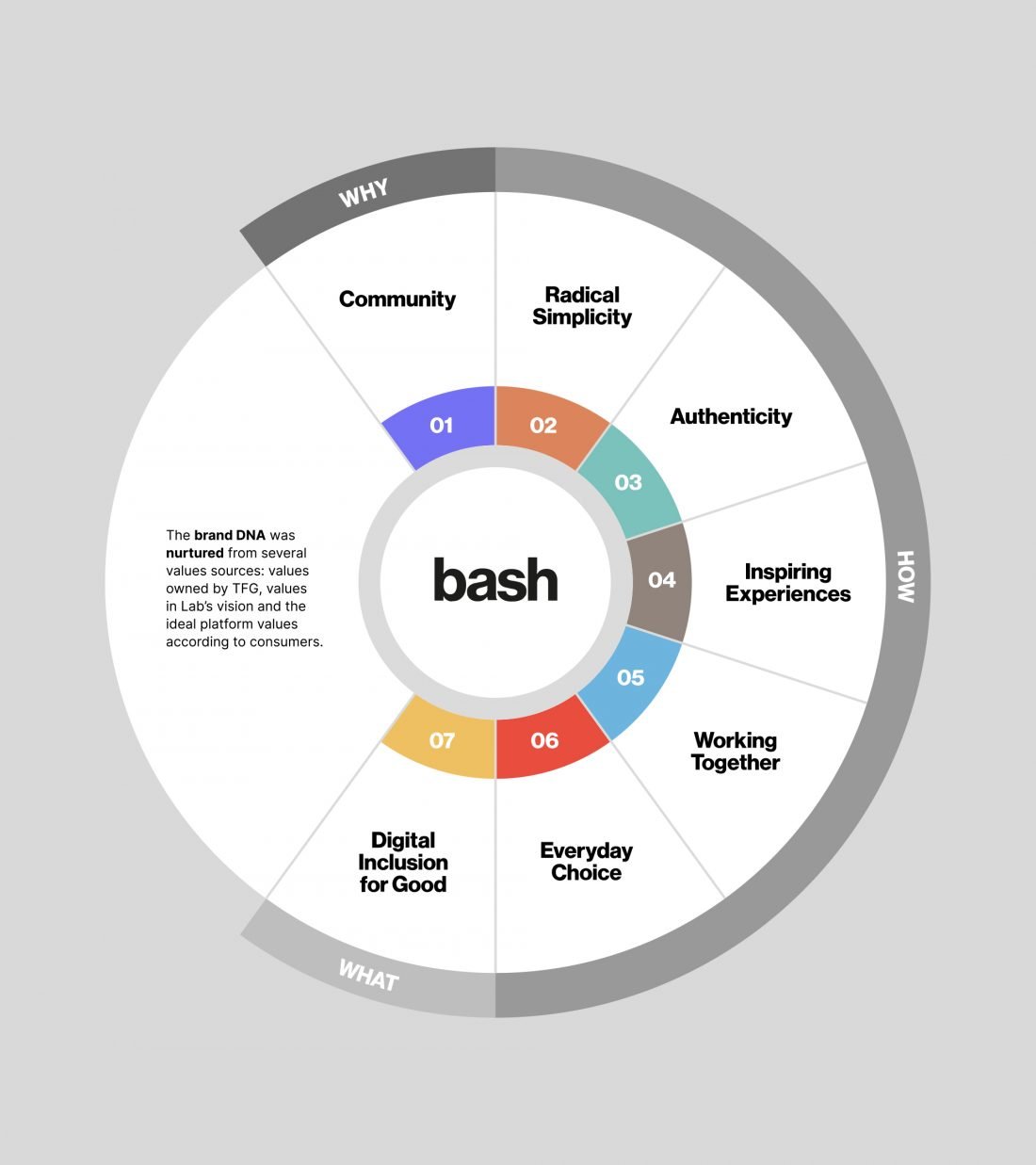
The new brand was to be born with the best of TFG’s legacy, vision, and what a digital-native platform ought to be: user-centric. For that, we put our bespoke framework with Relevance to work in order to merge three streams of values into one ideal brand DNA.
So Bash emerged as the new platform brand, built from the ground up with values like radical simplicity and community at its very core. A brand that stands for the community, because it is part of something bigger: the biggest and most empowered community in the African continent, made possible by trust, made real by technology. A brand with a clear purpose: We believe in the transformative power of bringing people together. A new and more empowered way of living and doing business for South Africans and for the whole continent.
The project was not only about digitally transforming the company but also about a cultural change.
A radically simple name with universal appeal
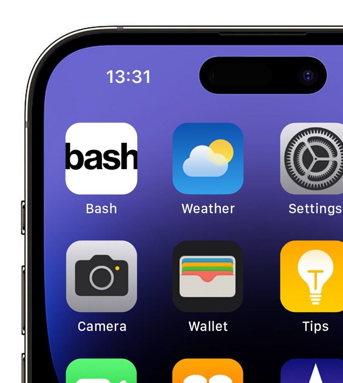
As the saying goes: simplicity is the ultimate sophistication. But easy as it might seem, getting to Bash was quite an undertaking, not exempt from challenges. For the naming process we worked with international and local Brand Naming experts, and from a list of hundreds, 5 pre-selected names were tested with users, as part of our tailor-made framework with Relevance for the project. The result: a four-letter name in 2022, living at bash.com. Quite something!
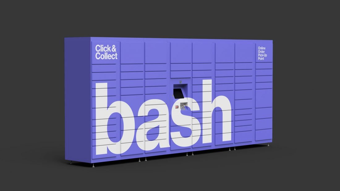
The name and narrative truly inspired an action-driven, human-centric brand. One with a clear voice and character, rooted in values. An ambitious brand made possible by a team of tireless achievers for a community seeking growth in all senses. We worked hard with the Bash team to create a 360º brand, authentic and flexible enough to talk to many audiences, from buyers to sellers, from fashion brands to delivery partners.
We worked hard with the Bash team to create a 360º brand, authentic and flexible enough to talk to many audiences, from buyers to sellers, from fashion brands to delivery partners.
Logotype
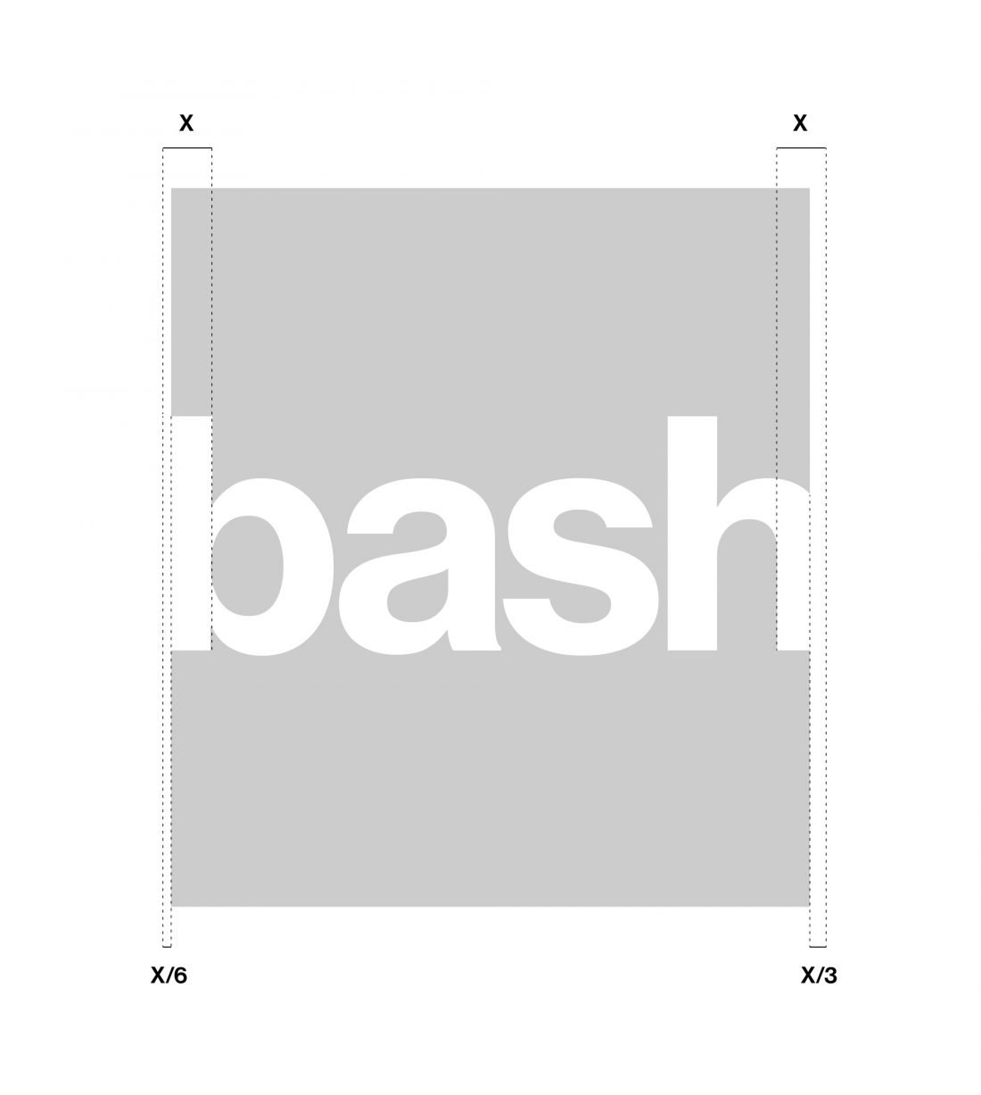
The logotype is 100% typographic to highlight the value of radical simplicity. Focusing on the name. Four letters with a lot of power.
Bash, as an omni-channel platform, is designed to be ever expansive. Its logotype equally expands beyond its frame to enhance its visual impact.
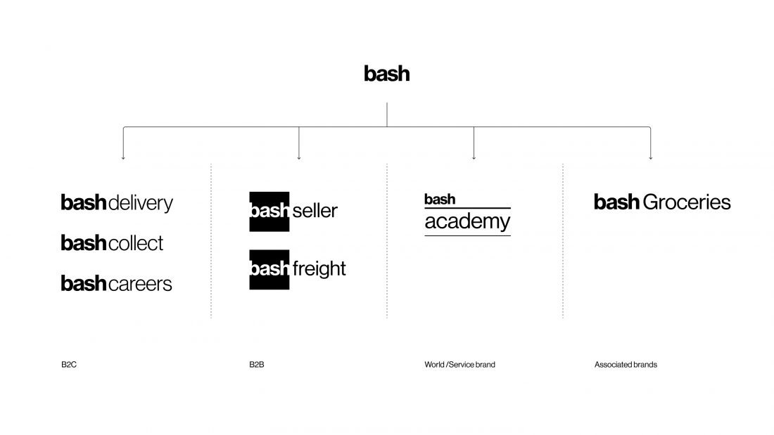
The Bash brand is immense. To keep simplicity throughout, all of its sub-brands are constructed typographically from the minimum number of elements.
Embracing whole worlds
Bash comprises a conundrum of sub-brands for which we articulated a strong yet flexible brand architecture. A monolithic branded house that embraces whole worlds, and a wide portfolio of transversal products, services and features. Bash is the center for this new ecosystem.
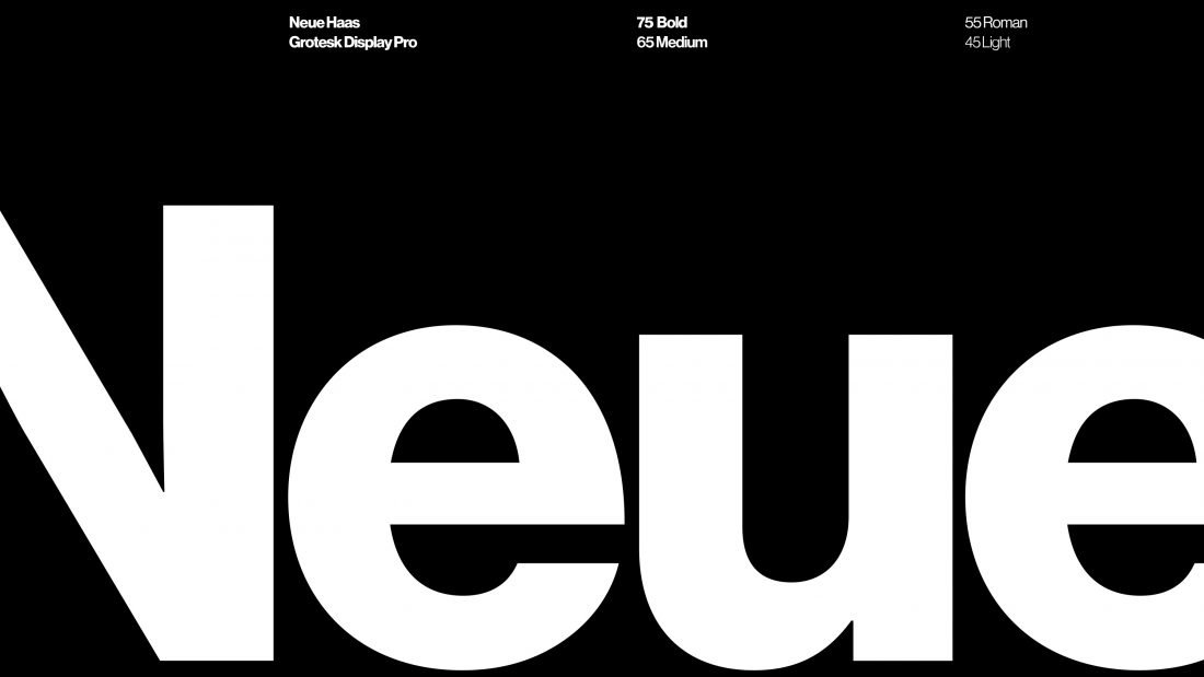
Typography
Layout
Colour
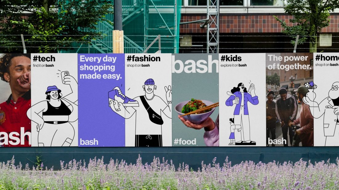
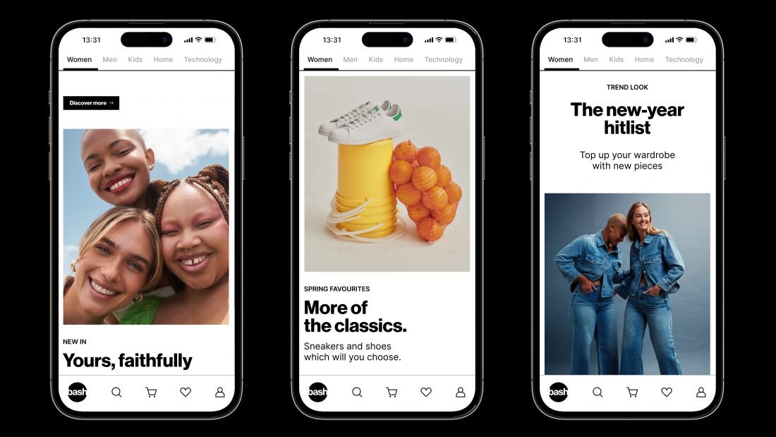
All Bash communication is designed in black and white. Colour is primarily communicated through images.
Bash Violet
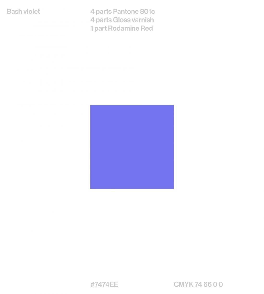
Outside the app and website the brand needs more visibility to be recognisable. The Delivery area of the brand has to be competitive to stand out.
That’s why we created a custom colour, the “Bash violet”.
Secondary palette
Icons
As part of the visual system and to improve the user experience of the app, we also designed a set of minimalist icons: clear, direct and light.
Art Direction
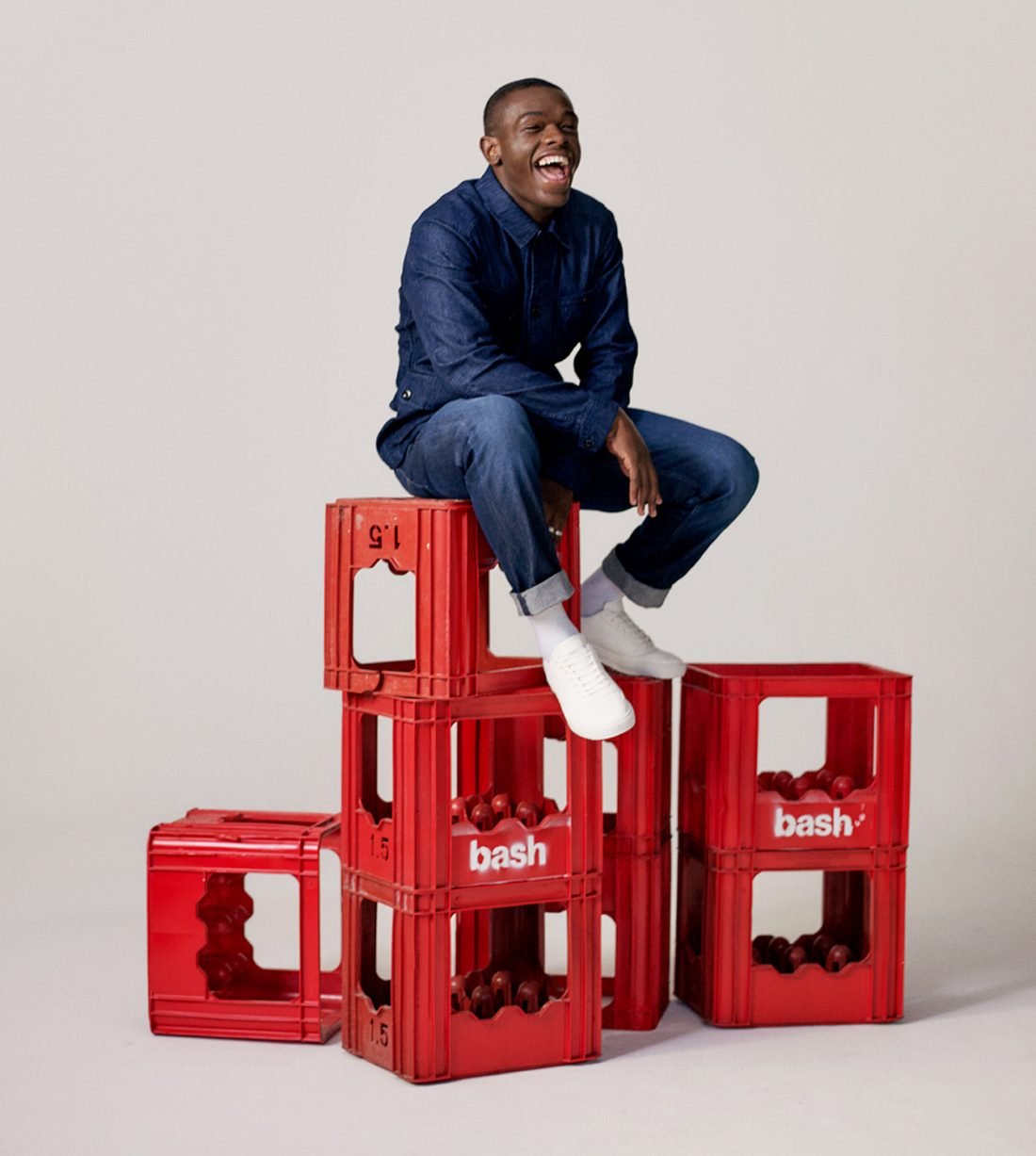
The main idea of the photographic art direction is the use of everyday elements based on the day-to-day reality of South Africa, looking for a more authentic and close approach.
We worked on the photography related to strong brand values such as: community, inclusion and diversity. Always looking for vibrant colours to capture the attention. Also, because Bash has very different offerings (fashion, jewellery, tech, home, etc) we defined a different setting for each of them, based on light, focus, context.
Illustration
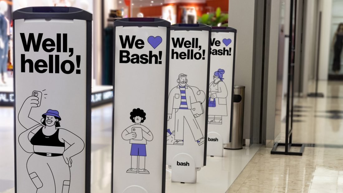
We worked with Miguel Camprubí to create a set of exclusive illustrations for Bash, based on the most representative members of South African culture.
The illustration style is based on the minimalist comics of the 60’s, with super fine lines and synthesis of elements. These appeal to the concept of “essential”, they are close and friendly, and handcrafted to express the human touch.
Motion
Thru was in charge of the motion; subtle and simple touches that soften the online interfaces such as social networks and digital advertising, to make the experience even more pleasant.
Sound
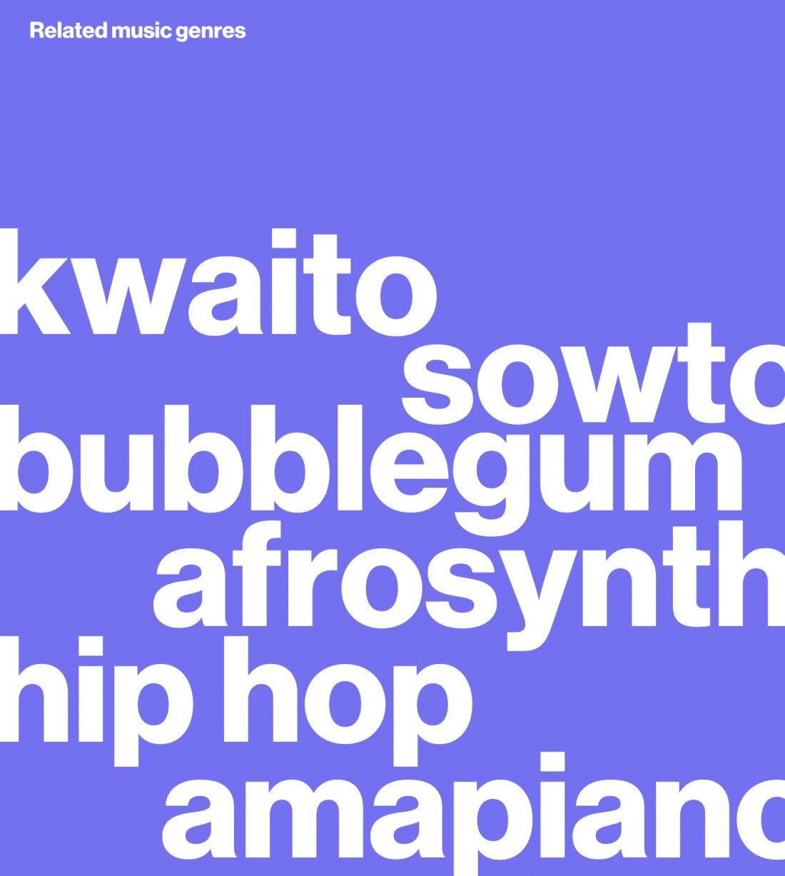
The sound design was done by the people at Banjo. The mix of digital and acoustic instruments communicates the values of our golden circle effectively. We strongly believe that rhythm needs to lead the logo. Dance-friendly patterns invite you to dance together as part of a community and celebrate. The result is a great musical collage made up of short sonic particles that form Bash’s sonic DNA.
Tone of Voice
Bash is for everyone, and its voice is the expression of its mission. By extracting three tonal attributes from each of the brand’s values, we built a consistent and versatile voice that serves to provide a nuance scale for the new Bash brands.
A tone that resonates and feels relevant to all kinds of consumers, but at the same time authentic, distinctive and easily recognisable. A tone that translates into fresh, concise messages that are close to the way our customers speak.
The beginning
