SXSW is the premier destination for discovery. First celebrated in 1987, The South By South West – SXSW , is a conference and festival held in Texas’ Austin all about the convergence of the interactive, film and music industries, fostering creative and professional growth. Over the past eight years, Foxtrot has revamped yearly the SXSW brand identity. The best word that could describe the 2017’s identity is “transformation”. Foxtrot has cleverly reimagined the brand’s visual expression, design ecosystem and interfaces.The Berries interviewed Ryan Thompson and Jann Baskett, Director of Visual Design and Creative Director of Foxtrot, to delve into the backstage of the project.
![]()
BB: SXSW reinvents its brand identity each year with Foxtrot. In a nutshell, what inspired the 2017 brand identity ? What are the main attributes of the new identity?

RT: The impetus for the 2017 rebranding effort was to develop a unified identity system for SXSW’s diverse programming.
As SXSW has grown year after year, the number of events, competitions, exhibitions, topics, and festivals all competing for attention grew as well. Without a unified system for these properties the experience for attendees was becoming disjointed and confusing at times.
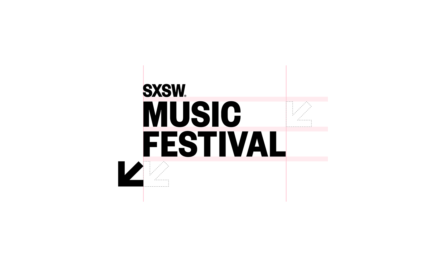
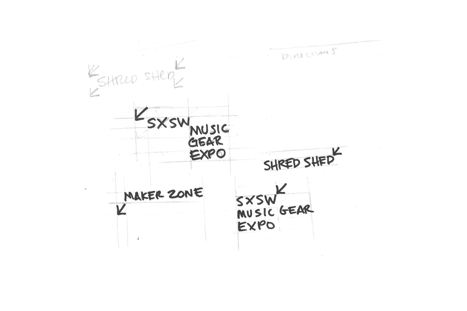
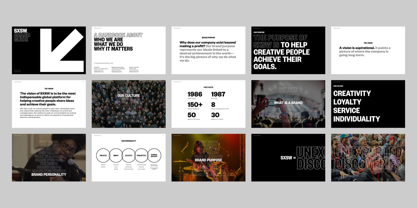
Our task was to look beyond a simple logo redesign to a larger system that would encompass all of SXSW. To eliminate the burden of reinventing the entire system annually or redesigning complex logo lockups each year, we employed a dynamic typographic-led framework for the identity.
Central to this new framework was re-imagining how the primary logo would influence the overall system to create an ownable, lasting identity.
An element that features prominently in the new design system is a southwest-pointing arrow. The arrow design had been around in one form or another since 1987, the very first year of SXSW. It survived 30 years of redesigns and trends, showing up in various places with each year’s look-and-feel.
Our team felt that the SXSW arrow would be a piece of meaningful history that could find new life in the larger system and become a recognizable mark for years to come.
![]()

BB: In the new brand identity, Foxtrot has opted for a more clean and sharp look and feel. Going with a solid wordmark, typeface, new icon, and ditching the diverse color palette used since 2009. Does this reflect a change in the brand strategy?

JB: Leading up to the visual redesign, Foxtrot led a brand assessment and strategy with SXSW. The company had grown into a global brand organically, so the strategy was less a change than a crisp articulation of what it had already become—an essential destination for unexpected discovery.
Until the 2017 rebrand, the design efforts around the identity primarily addressed the needs of promoting the Music, Film, and Interactive conference and festivals as three distinct offerings. The new system reflects the evolution to more converged programming.
BB: In 2017’s new brand identity, Foxtrot came up with a design ecosystem that highlights the digital experience of the festival. Does the new identity make SXSW “a more digital-friendly” brand ? Please elaborate
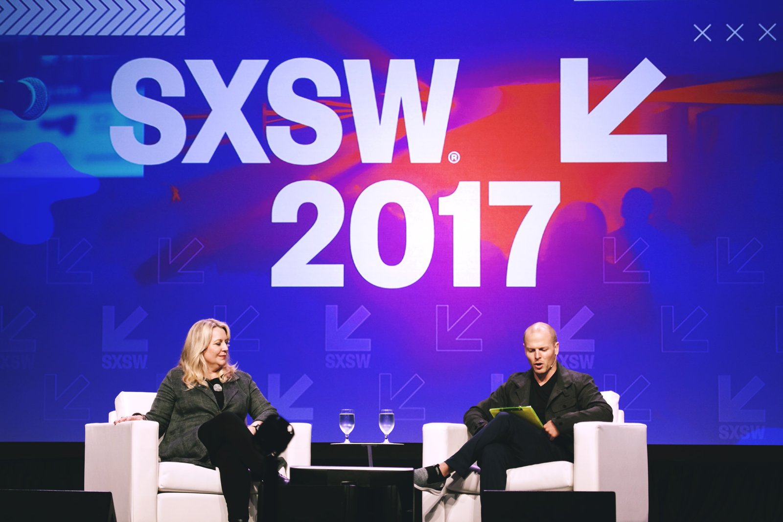
RT: For the 2017 artwork, we looked at representing the diversity of experiences at SXSW through the use of photo-collage and lively color. Our primary inspiration was the lighting found on conference and event stages at SXSW. We then layered in elements like graphic patterns and pixel glitches to signal the energetic atmosphere at the event. The concept overall celebrated the anticipation and excitement of the SXSW event.
SXSW has always been a digital-friendly platform, and we knew that the branding would have to hold up across various media—from giant street banners to mobile devices used in darkly-lit spaces.
BB: SXSW is known as a go-to place for innovation in diverse disciplines. In your opinion, does the new identity strengthen its brand position?

RT: Absolutely. The purpose of SXSW is to help creative people achieve their goals. One way SXSW achieves this is by being the platform for diverse topics and people to come together.
The idea of SXSW being a cultural platform or stage was very much at the forefront of our thinking. The identity system supports this idea by providing a clear, consistent framework around which ideas and opinions can be expressed without the brand getting in the way.
This systematic approach naturally acts as wayfinding both digitally and in signage year-to-year.
BB: In its new design, Foxtrot tossed away the famous quirky font for a functional and agile one, pushing the brand more and more away from the fun and festive feel. What inspired such a decision ? Has this affected brand recognition?

RT: The new unified identity system was designed to allow for a dramatic reimagining of the overall look and feel each year through unique, exciting artwork. The logo or new font choices no longer have to carry all the personality for the event.
Establishing a consistent, recognizable identity, instead of having a visual moving target, has improved brand recognition and equity dramatically.
The new system uses Founders Grotesk from Kris Sowersby (Klim), a distinctive type family celebrated for its versatility. The bold condensed weight gives the identity system a careful authority while the text weights add a dash of quirkiness without compromising legibility.
BB: This year a complete identity design system was crafted by Foxtrot, giving the SXSW brand a solid yet agile foundation to capitalize on every year. Does this make the 2017 identity of SXSW the most consistent, guided and strongest identity of all times?
RT: The team at SXSW enthusiastically welcomed the new system and guidelines from the beginning. The rebranding efforts have resulted in the most disciplined, yet flexible system for SXSW in recent history. The identity itself is intentionally timeless. By focusing on functionality and consistency for the logo we were able to maximize the creative potential of the annual event look-and-feel, which is the heart of the SXSW experience.