
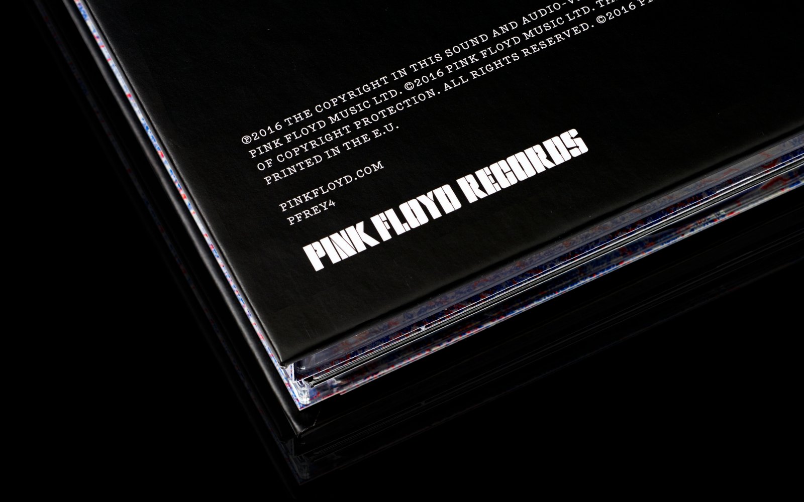
BB: Pentagram has collaborated with one of the most celebrated music brands in the world, Pink Floyd, to design a new visual identity for its new music label “Pink Floyd Records”. What sets Pink Floyd as a band brand apart from others in the marketplace ?
HP: I think Pink Floyd are set apart because they created a musical approach particular to themselves. They were inventive and era defining in the ’60s & ’70s and carried on true to their vision until the final split. Any band that can do that rightly deserves to be celebrated.
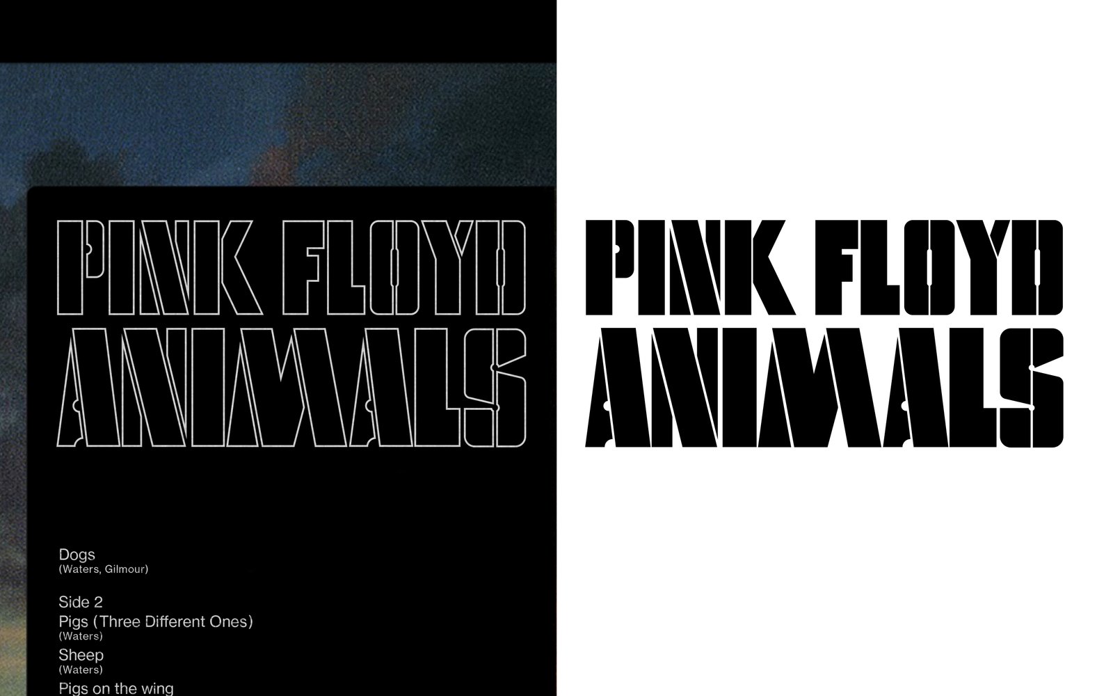
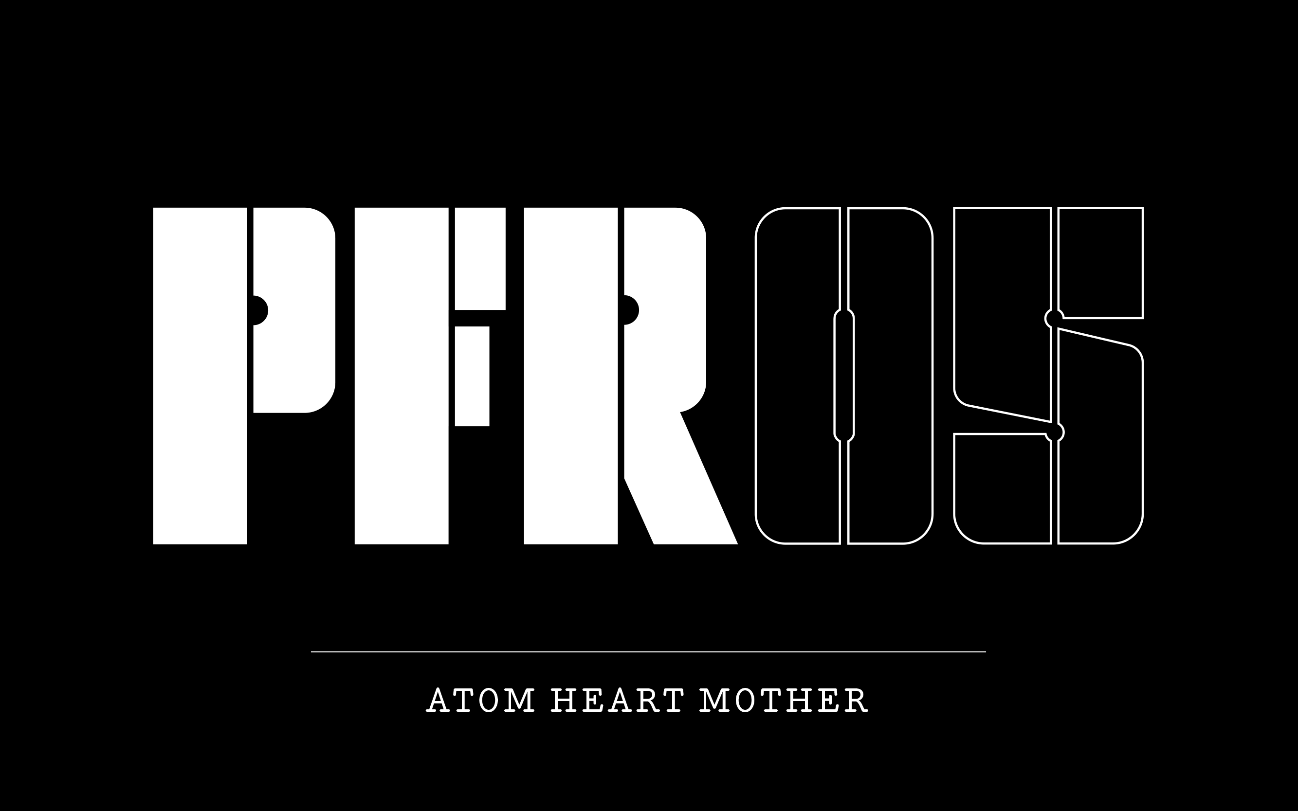
BB: In creating the new visual identity, Pentagram has capitalized on the typeface of one of the most iconic albums of the band “Animals” from 1977. Can you please elaborate on what inspired such a decision ?
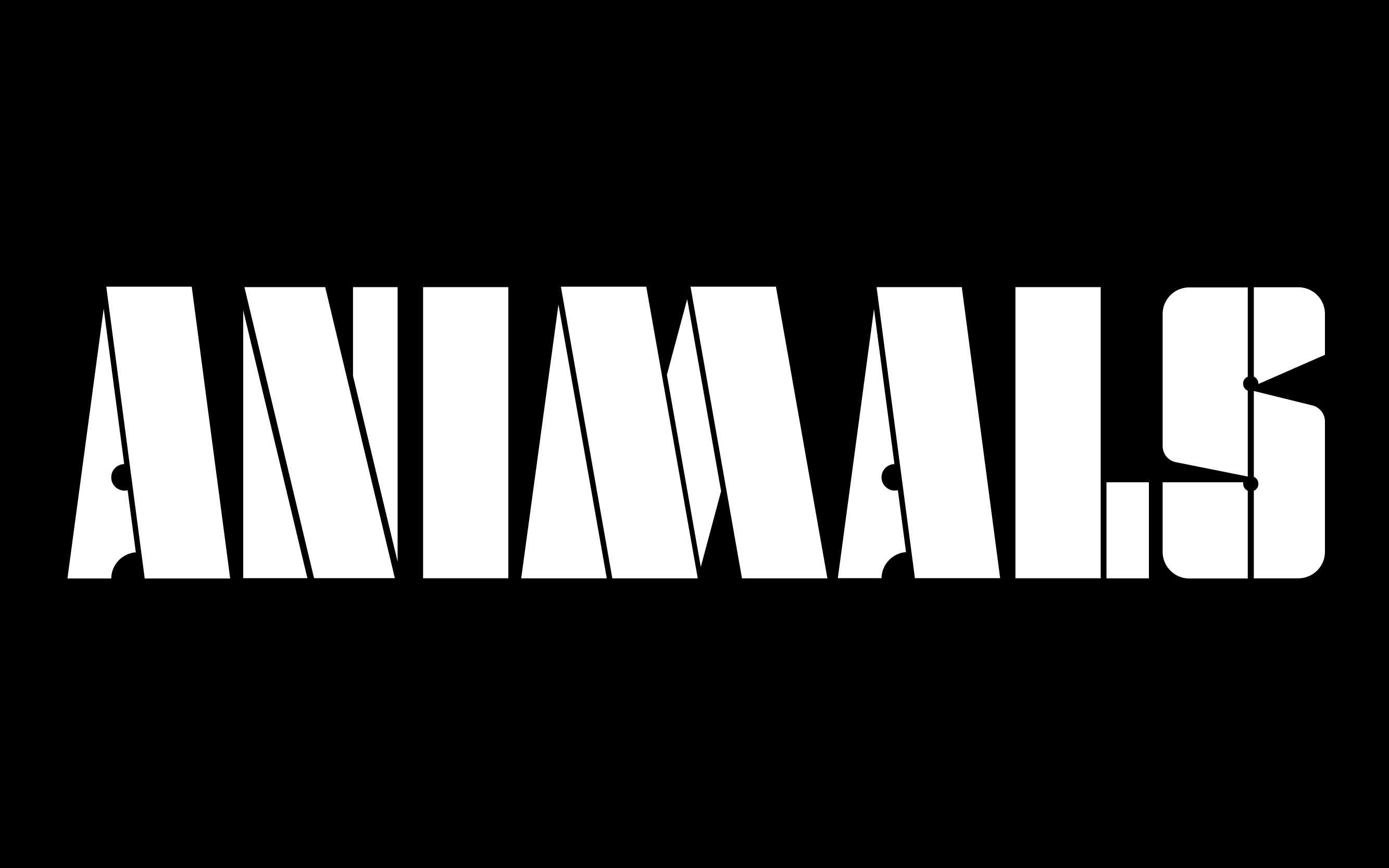
HP: The new visual identity is born of their own story. The original lettering came from a mark made by the design company Hypnosis for the band’s Animals album. It carried an existing narrative, a sensitivity and authenticity which meant it was already part of their story. It can never tell the whole story but is intended to invite you into the greater story.
BB: Branding is all about storytelling whereas it helps develop a strong brand narrative and establish a unique persona. How can the new visual identity of Pink Floyd best tell the story of the longstanding band ?

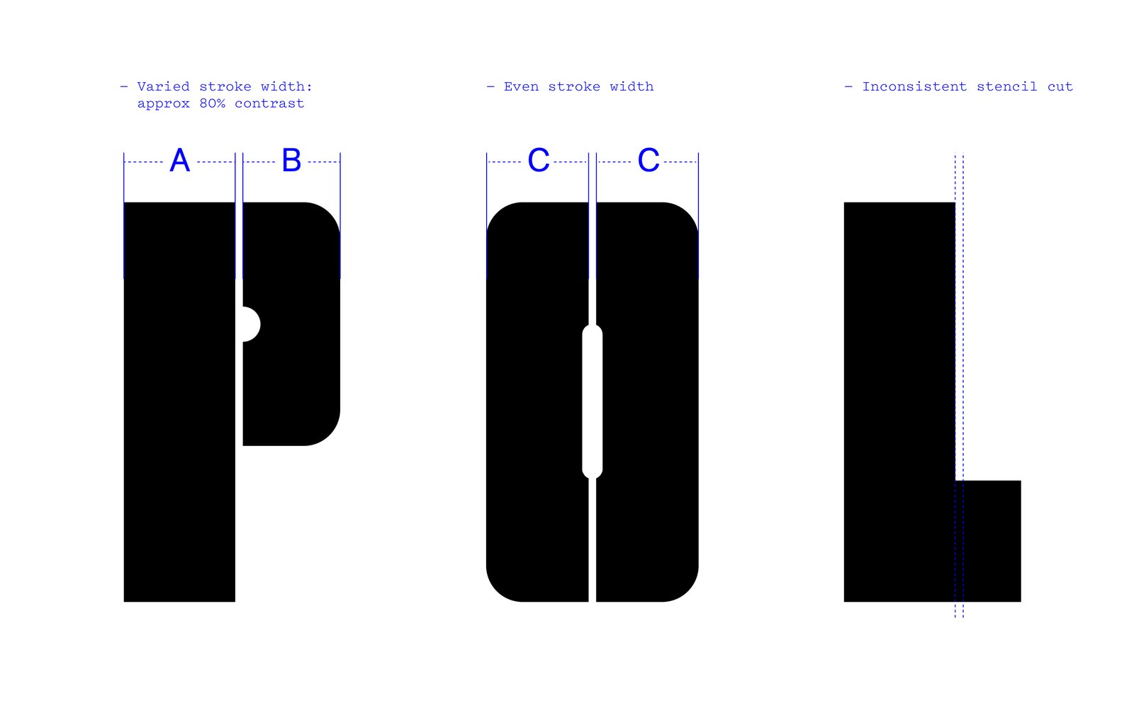
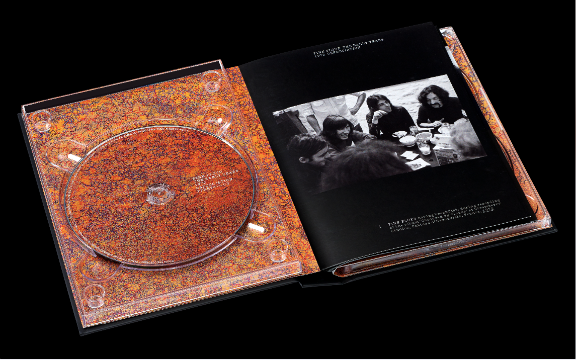
HP: Even though the original mark was made for a static, vinyl format in 1977 we created differing weights of letterform and alphabet that allowed them to be reduced to single letter motifs. It runs beautifully online as well as in print – a testament to the original vision of Hypnosis.
BB: With shedding some lights on this project, how will the design preserve the brand’s legacy & heritage and at the same time roll out a fresh and contemporary visual identity ?
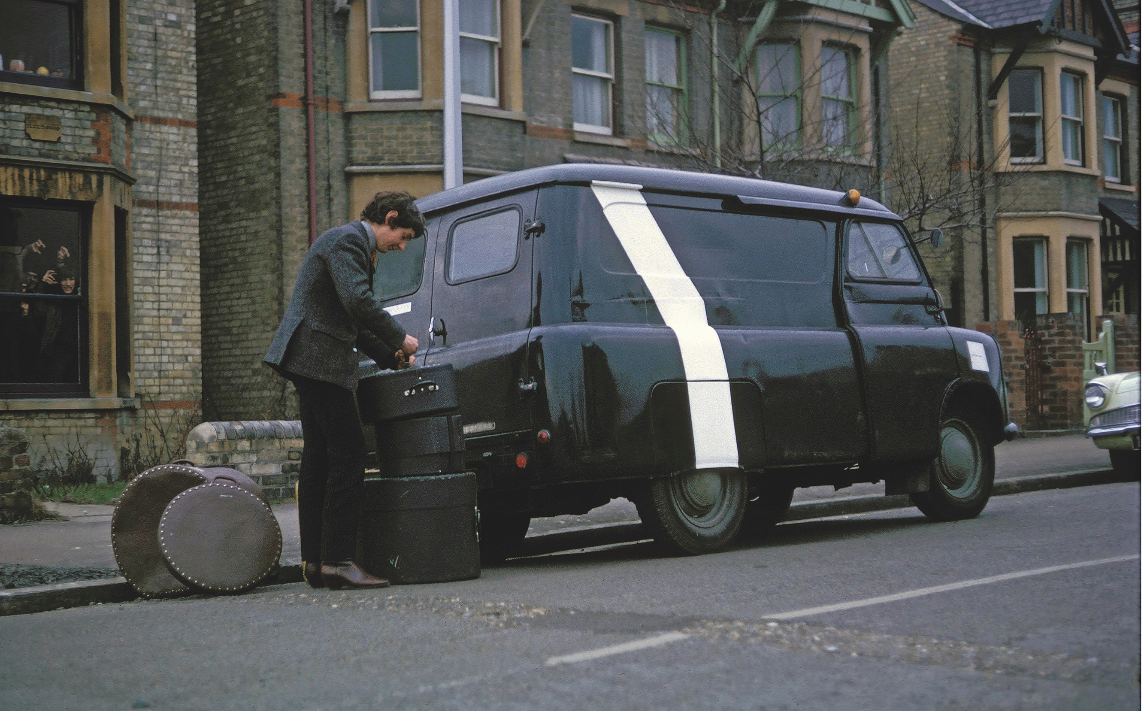
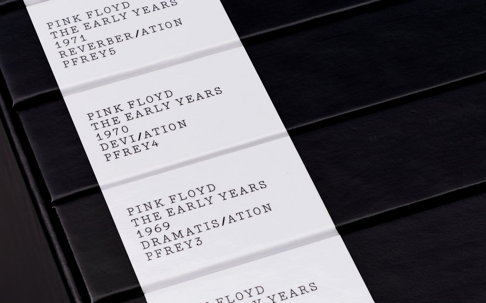
HP: We chose to use the mark from Animals because it was from the central era of the Pink Floyd cannon of work. It represents a time when the band were all together. The band also liked the choice because it reminded them of the stencil lettering on their tour equipment boxes.
BB: Can you mention some tips and tricks that help independent musicians create a consistent, powerful and engaging music brand ?
HP: There are no tricks, but more a hunt for something memorable that captures the real essence of the music it represents. The more power in that connection the greater the possibility of capturing peoples imagination. It’s good to remember that its not just a mark or a logo, it’s a whole way of communicating the soul of the music visually – a kind of silent music all of its own.