![]()
Las Vegas annually ranks as one of the world’s most visited tourist destinations. Being the entertainment capital of the world, its a city that honors the cultural diversity of its local Las Vegans while also capturing the essence and glamor of the iconic city. In one of its most exciting and challenging projects, Pink Kitty Creative, was hired to redesign the brand identity of the city. The Berries interviewed Victoria Hart, Founding President and CEO of Pink Kitty Creative to know how thrilling the experience was.

BB: Why do places need rebranding?
VH: Cities are often considered a reflection of the people who live in them. This makes ‘places’ no different than products or people when it comes to the need for an attractive and relevant brand. When your city is a desired travel destination like Las Vegas, that value gives city officials and locals more of a reason to support a relevant brand that fits the style and personality of the area. A great brand is an asset to any city because it can help attract tourists, investors, corporations, and happy homebuyers.
BB: The City of Las Vegas is one of the most unique hot spots in the world. Since places are reflection of their distinct identity; does branding reflect the identity of the place or can it reshape it?
VH: I believe it can do both, especially in a city like Las Vegas where there’s a rich history to pull from. Re-branding efforts should both honor and advance the brand’s existing identity while also adding value, relevance and resonance within the community. Rebranding a city is expensive and can have negative repercussions if not well received. When executed properly however, a great brand can be a valuable international asset to a city. For example, while collecting research for the city of Las Vegas rebranding project I was inspired by the cities of Amsterdam, Melbourne and the Bahamas.
BB: How can rebranding a country’s most iconic places enhance the brand of the nation as a whole? In other words, how can nations utilize rebranding for its iconic landmarks in tourism marketing?
VH: In the same way that a strong and attractive brand can enhance the perceived value of a city, a great brand is becoming one of the central ways that countries work to enhance the image of their nations. By harnessing the power of branding to reinvigorate interest in a nation’s landmarks, nation branding and marketing can enhance the image of a nation in regard to tourism, trade, and even public diplomacy.
BB: How can a brand strategy preserve the “stereotype” elements that the place is well known for while incorporating an element of surprise?
VH: A city as culturally diverse and rich in history as Las Vegas can be too difficult to define with merely one iconic image or element. Nuance is what makes re-branding effective and I think it is important to do the research; to understand your target audience and stay true to your client’s vision. For any rebranding, a designer should have an intimate understanding of where the brand will live and the lives it will touch.
BB: Rebranding the City of Las Vegas required intensive research about the place, its heritage, and culture. What is the integral role that brand research plays in rebranding places?
VH: Research is everything! I consider research to be key not only for rebranding places, but for every design project I take on. Many of my clients will come to the table with data and facts but I believe that if you have not lived it, or experienced it, the information is not complete. That’s why research and strategy are the foundation of good design. We are not here to make pretty pictures; we are here to create an icon that will serve your community for years to come.
BB: Las Vegas is a hub for multiculturalism, where tourists come from all over the world with their culture diversity and taste. How were you able to design a brand identity that appeals to this multitude of diversity?
VH: This was one of the most challenging aspects of the project because Las Vegas means different things to those who live here than those who visit from all over the world. In this sense, there are two completely different perspectives of Las Vegas and I had to determine if the logo should embrace tourists’ perceptions, locals’ realities or strive to do both.
For the most part, I found that visitors see Las Vegas as synonymous with world-class entertainment. They think of gambling, nightlife, performances, hotels, and as a fabulous vacation get-a-way. For locals however, Las Vegas is a place with great weather, amazing mountain ranges, desert trails, great food, a thriving local art scene and downtown community, museums, a world-class performing arts center and affordable living.
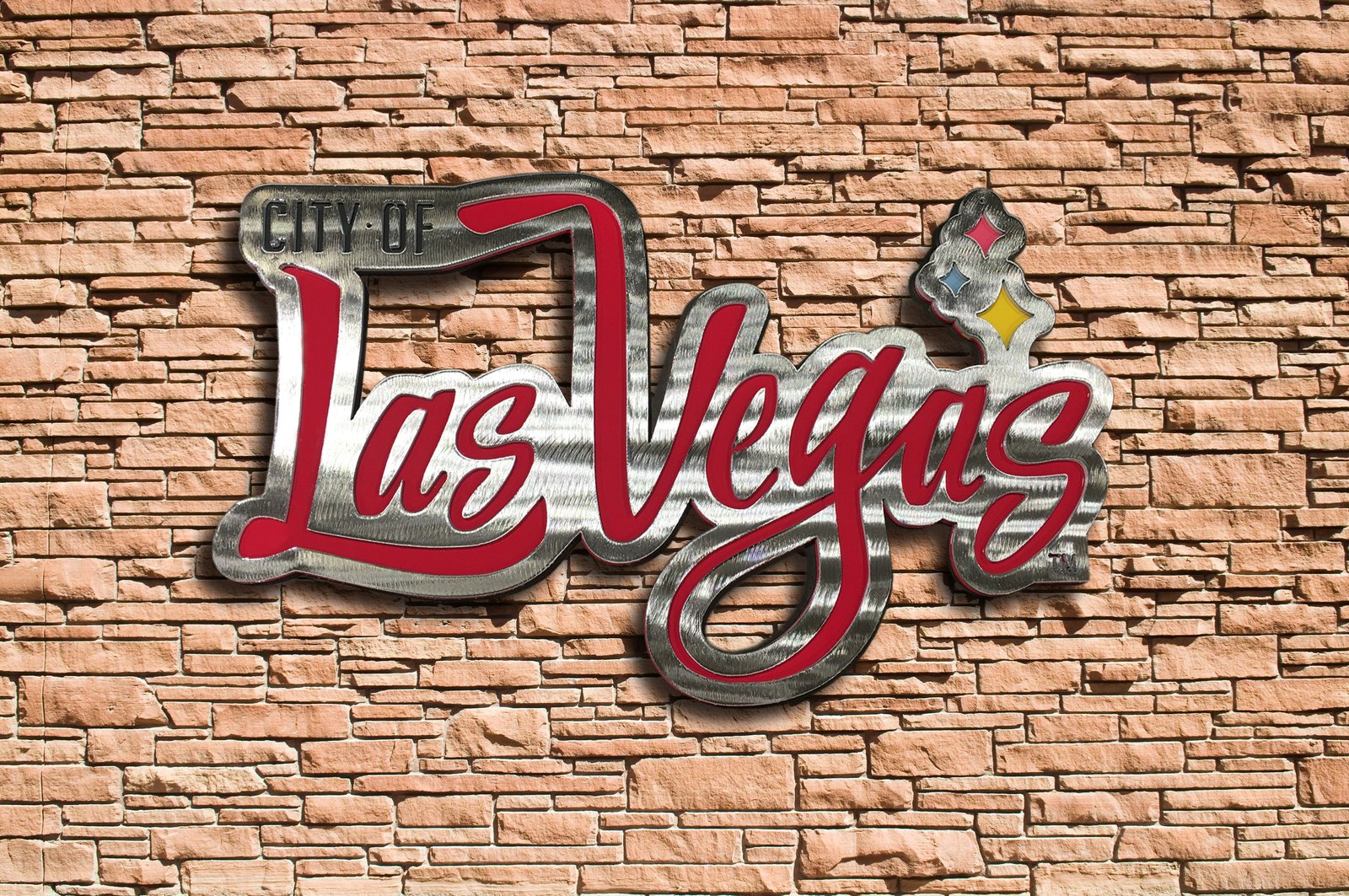
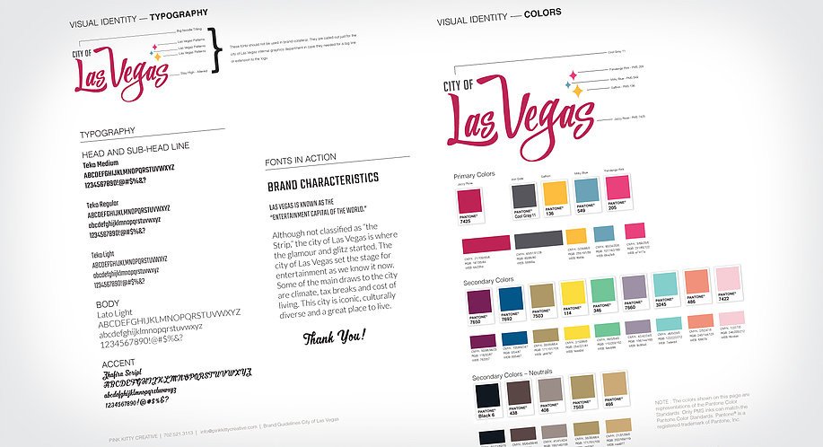
The creative brief given to me by the City of Las Vegas called for a brand that could capture the following adjectives: iconic, timeless, progressive, modern, fresh, exciting and with a nod to the glamorous era of yesterday.
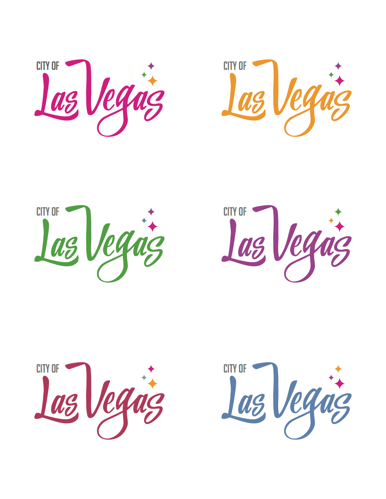
In keeping with the creative brief from the city, the new logo was designed to embody the iconic and timeless glamor of the city’s history, while still paying homage to modern aesthetics. By combining both classic and retro imagery via the logo’s signature stars and using a vibrant color pallet to create a memorable and energetic logo, we were able to create a logo befitting of the city it represents.
It was also important not be confused with the efforts of the Las Vegas Convention and Visitors Authority (LVCVA) who position themselves as the official destination marketing organization of Las Vegas. In addition to ongoing advocacy efforts to extend the city’s influence as a leader in tourism and hospitality, LVCVA promotes tourism, conventions, meetings and special events. They, along with R&R Partners, are responsible for the “What happens here, stays here” campaign.
The city of Las Vegas hired multiple agencies to design the new brand. Pink Kitty Creative was the chosen agency as our logo was selected by a panel of Las Vegas marketing professionals and tested by Applied Analysis/Discovery Nevada, a local market research firm, which surveyed a statistical valid sample of city of Las Vegas residents, who ultimately chose this as the winning mark.