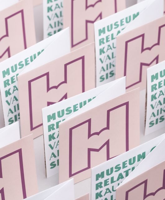
![]()
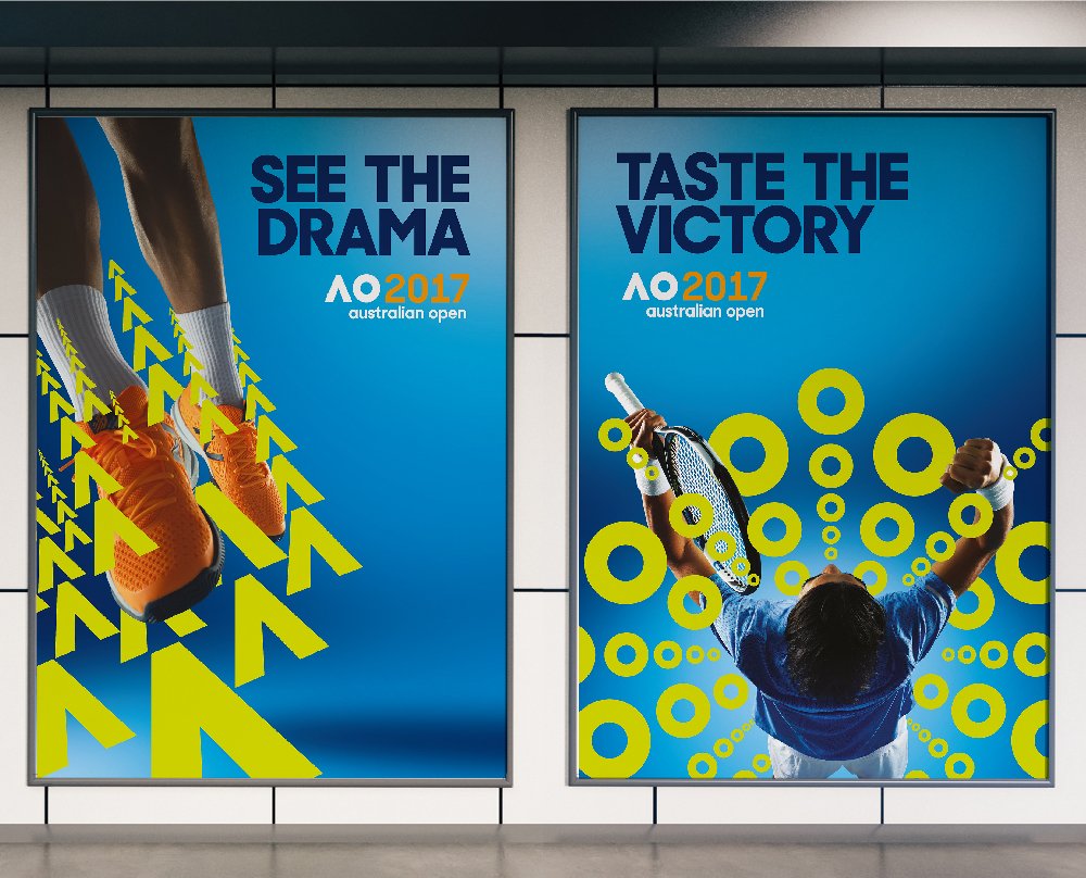
Every January the eyes of tennis fans from around the world are fixed on Melbourne, watching their favorite players compete to land a grand slam. Held annually in Melbourne since 1905, with a huge attendance of 720K, the Australian Open -an international renewed major tennis tournament- is one of the most anticipated four Grand Slam tournaments, along with the French Open, Wimbledon, and the US Open. The Australian Open brand identity has witnessed a recent revamp, designed and introduced by Landor Australia. The Berries interviewed Nick Davis, General Manger of Landor Australia.

BB:Global Sports Tournaments can be used as an iconic brand for their nations. In your opinion, did rebranding Australian Open help Australia elevate its brand as a country ?
ND: Well, I will be honest with you and say it wasn’t part of our brief. What was in the brief was to reimagine a brand fit for the global stage. We aimed to create a brand that actually wasn’t too anchored in Australia and in the physicality of its event, but could transcend boundaries both physical and digital. We aimed to free this brand up.
BB: For new identity of the Australian open, a revolutionary revamp was chosen. In your view, based on which criteria should a brand choose a revolutionary revamp rather than an evolutionary one on the existing identity?
ND: Most organisations looking to rebrand are doing it for a reason. It might be they are losing customer relevance, declining in market share, or that their brand no longer fits with an evolving offer. If a brand is concerned for any of these reasons then rebranding (a new strategy, a new identity and ideally new activity) is a proven way of reconnecting with your customer. In that case we would always say that holding on to your past is not a good idea. Branding has to be very focused and single-minded to cut through and make the customer connection. To that end, it is quite unhelpful to think in evolutionary terms. Brand equity may lie in specific visual assets, but if your brand is in trouble, we would argue those assets should be questioned. Just because they’ve been around a long time doesn’t make them valuable for the future.
BB: How can you revamp the identity of a globally known sports tournament giving it a more contemporary look and at the same time preserving the heritage of the brand ?
ND: This continues the theme of the point above. Heritage can be an important part of a brand’s story but it is rarely the platform for a brand’s future. So you have to be quite bold, and take a brand firmly towards its future—and take customers there with you—and not get held back by nostalgia and past glories. Of course you don’t want to lose valued custom so you always take care to transition the customer base with you. But ultimately branding is a path to the future, not a reflection on the past. In today’s age, where people, companies and categories are changing very, very quickly, it pays to be a brand that has vision for its own future and can demonstrate agility in adapting to change.

BB: Branding now is all about the experience, can you give us some insight about the techniques of transforming a sports brands into an entertainment experiences ?
ND: Well, first of all, it’s important to create the brand to be a platform for activity. Branding is no longer about putting a sticker on something you do, it’s about helping bring to life what you do. So you have to think first about how this brand is interacted with, the relationship it seeks with its audiences and its channels. Then you build an identity system that inspires, supports and helps deliver the experience. One of the key techniques is to design the brand to move, to be interacted with, to be something that adapts and responds to, interaction. From there, you have something that feels tangible that lends itself to experience creation, not only billboards and letterheads.

BB: Concerning the new brand mark, the old identity was highly reflecting the idea of a tennis tournament, in the new identity the brand mark is all about the name, using the initials of the tournament, did this have an effect on the audience perception of the brand or the brand essence ?
ND: If you look closely at the old identity I agree you can see the ‘serving man’ in the logo, and that says ‘tennis’. What we wanted to do was get away from such a simplistic and obvious association. The brand needs to stand for more than tennis—and that was central to our briefing from Tennis Australia. So, we needed a brand which expressed less, ‘this is tennis’ and more ‘this is entertainment’. In our research we found that what makes the Australian Open different to any tennis tournament and what makes it an incredible experience is the attitude and atmosphere. It’s a tournament that welcomes and encourages participation and enthusiasm. It’s dynamic and free-spirited. So that’s what our new identity represents and will help deliver as an experience. Time will tell if people fail to understand it’s still a tennis tournament at core!