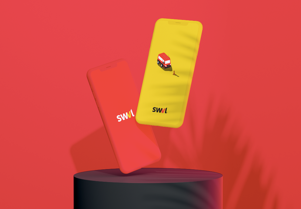
SWVL, an Egyptian-originated bus ride-hailing transportation network that operates in the Middle East, Africa and Pakistan, has recently rolled out a refined update to its visual identity system paving the way for the future of the brand. The rebrand was designed by Cairo-based pew. design bureau.
We have exclusively interviewed Al Hassan Elwan and Nourhan Ayman, co-founders of pew. design bureau to get to know the inside story of the rebrand, how do they “pew” and what’s next for the bureau.
BB: “pew.” is starting to make a lot of noise in the creative sphere, who are you guys? and how do you “Pew” ?

Al Hassan Elwan 
Nourhan Ayman
AE & NA: Well first things first, thank you, Brandberries, for this opportunity to amplify the noise. We’re pew., all lowercase letters, a design bureau that really believes in advocating design for better business. That pretty much sums up how we do things. We’re all tired of industry jargon, especially readers on here; so we don’t want to bore anyone with that. Allow us to introduce ourselves, Nourhan and Al Hassan, co-founders and design directors of pew. design bureau. It all started in 2017 when we quit our corporate senior designer jobs and decided to go full-time advocacy – through our own business. Ever since, we’ve helped more than a hundred brands elevate their design & branding game; from startups that never made it to giants like Google & Unilever. Now authenticity is key right? We’re gonna be honest with you, most of the noise we’ve made was about how “aesthetically pleasing” our work looks, yet every meeting we’re in we’re trying to convince people that that’s the last thing that matters. Our ultimate dream is for businesses to let go of all subjective bias when it comes to design and let experimentation and testing do the talking. Hopefully you’ll see our point by the end of this interview.
BB: Pew is the agency behind the recent roll out of the SWVL rebrand. In an increasingly crowded landscape of design agencies, why did SWVL choose Pew for the rebrand? What did you guys bring to the table?
AE & NA: So rebranding can be a challenging process. And organizations may opt for a rebranding for a variety of purposes. At times, it’s just an arbitrary attempt at shaking off the trees in hopes that some new fruits fall off. Yet, that approach can always be risky. Luckily, the people of SWVL knew their problems and challenges that they hoped the rebranding would solve. After a couple of brand discovery sessions together and days of research, we laid out everything from vision to the technical rebranding objectives.
Ultimately, in turn, that helped us know more about SWVL—what it was, what it has become now, and what we needed to accomplish from a branding and design standpoint to help the public see this evolution. And it was actually fairly easy for us to be invested in the story of their evolution. We like to think this was one of the things SWVL personnel appreciated the most about working with us: we were ever so true to their story and we took time to discuss with them how every tiny design or strategy decision we made played into that story. We made sure they were involved in every step of the way. It’s something we say a lot about our business partners, but the relationship between pew. and SWVL was far from a client-agency relationship. It was just a bunch of super excited collaborators who couldn’t wait to tell the world a really interesting success story.
BB: SWVL brand platform capitalizes on the concept of ‘Logic’. How were you able to narrate this platform creatively in the rebrand ?
AE & NA: It all started with a simple but most effective promise, “we save you time, money and comfort.”
It’s the most logical decision a consumer could make. That made the brand a hero of public transportation; a hero we envisioned as the brand mascot bus. A bus that enthusiastically took every chance it could to prove itself to the public. Now, years later, the hero simply knows a whole lot more about both the absurd environment it operates in and the superpowers it has to neutralize this absurdity.
Our hero is now more confident than ever and concludes it’s the only voice of logic amidst chaos, AKA, the streets of Egypt. So when it sees a truck going backwards on a highway or a bunch of watermelons floating around windshields, it remains adamant about getting its friends where they asked it to go. No matter how wild a ride can get, it always gets you where you need to be. We at pew. saw every SWVL ride as an experience that is just too good to be true. It’s real because it exists, but the fact that this exists is unreal. SWVL owned logic now. Yes, 1+1=2, but now it’s also 1+1=Whatever we want.
BB: Let’s dig deep into the creative aspect of the SWVL rebrand, which design aesthetic did you choose to go with and why? What were the main challenges you met?
AE & NA: We are never actually faced with the question “which design aesthetic should we choose” as it’s something we don’t believe in. We believe such decisions are dictated by the brand strategy and character; which later inform the aesthetic through its own true and unique process. That always yields better results than deciding early on to go for a certain look by speculation. So let’s go over our thought process quickly; given what we had already discussed in the previous questions.
The original identity had two main strongpoints to build upon; the red color and a hidden zigzag shape formed by the visual connection between the W and V letters. That zigzag had very special visual allure, but it had to justify itself conceptually for us and the SWVL team to be fully on-board with it. So it got us thinking; we’re talking about a real experience that takes place every day. But, it’s unreal that it does, given the drastic circumstances.
It’s as if SWVL buses are of a dual nature. It was right there in front of us, and the zigzag made a whole lot more sense now. We took that theme as the overarching concept and ran with it; we applied it in the visual system we created for the rebranding; an integration of visuals that showcase the real emotions customers have toward SWVL with visuals that celebrate the unreal-sounding fact that SWVL exists. We’ll get into specifics as we progress through the interview.

BB: Let’s talk a bit about the SWVL logo, what do we see before and after?
AE & NA: For the logo we believe SWVL had built a pretty good recall factor with their old logo; and neither of us wanted to lose that. We basically just gave it a unique, professional type treatment/significant adjustment, some optical balance optimization and a more vibrant shade of red. Oddly enough, the old primary red shade was a CMYK shade, whilst SWVL is a 95% digital communications brand. So they weren’t taking advantage of the all-embracing color range of screens. Subtle overlooked details like these often make the biggest differences when pointed out.

BB: Pew went full throttle in designing a full visually compelling brand identity system for SWVL. Can you briefly take us through these collection of elements and explain to us how they work together to communicate the brand value to the target audience?
AE & NA: It’s true; this is one of the most comprehensive projects we’ve worked on. We created everything from a custom type wordmark to illustration kits and iconography. As we mentioned, everything had to be cohesively tied together and feeding back the to overarching concept. The illustrations were a spot-on tool to communicate what the brand needed: tech and difference. They were perfect for creating the unreal worlds that defy logic, yet immediately resonate the familiar techy feel of modern-day startups. We could draw a Godzilla, a baladi dog or a bus in a flamingo inflatable and still remain consistent. Along with surreal imagery and the zigzag motif, it all came together with every element readied with what it needs to complete the bigger picture.
BB: We can’t end this interview without knowing, What is the next big thing for Pew?
AE & NA: Well, our good partners and clients witnessed our design process firsthand, and trusted us to take our expertise in design thinking into the physical experiential realm.
This is a quick overview of a project we did for YouTube last March, and we’re proudly taking that to the next level by launching our sister company, alt. [facebook.com/experiencealt] Stay tuned for the big things we’ll be announcing there! Thanks again to the lovely Branddberries team.
Fancy working with pew., reach out on biz@pewdesign.com