![]()
JFK International Air Terminal in New York— officially called Terminal 4- is one of the busiest terminals in the U.S. Built in 2001, it serves 32 international and domestic airlines with an annual passenger volume of 19.5 million travelers. In 2015 Terminal 4 went through an overhaul, a physical expansion and an identity change. The New York office of Base Design took on the project of rebranding Terminal 4, aiming to create engaging experience to the travelers that surpasses the traditional functionality of a terminal to become a destination on its own. The Berries interviewed Min Lew, Partner at Base Design to share some of place branding confessions.

BB: From your insights, why places and destinations need rebranding ?
ML: We live in an ever-expanding and increasingly transient world, where people, ideas and capital are more fluid than ever. Places need to rebrand themselves to bring their personalities to life in order to emotionally engage with residents and visitors. In order to stay relevant, characteristics and features that make a place iconic must be highlighted. By doing so, the place can create a sense of identity and pride amongst residents and cultivate curiosity amongst potential visitors, which in turn, drives more traffic and economic activity in the neighborhood. In our branding NYC’s Meatpacking District, we saw the effects of our work come true in the real world. We were tasked with changing the perception of the District from a more singular notion related to nightlife to a dynamic, cultural hub of art, design, fashion, food and technology. We designed a new visual brand identity system that manifests in different forms such as storefront designs, style guides, brochures, the district’s website and banners. By successfully communicating what the Meatpacking District stands for through its new identity, we created a renewed sense of pride and visibility around the neighborhood amongst residents and tourists alike.

BB: Airport terminals are an engaging experience to the travelers, they are surpassing the traditional functionality to become a destination on their own. With the rise of new concepts such as smart airports, how does a brand agency able to capture this experience that attracts and engages travelers?
ML: With the travel and aviation industries becoming more competitive as they try to attract their share of growing numbers of passengers, airports need to provide a differentiating, yet authentic service experience to attract and captivate travelers. In order to build an emotionally engaging and distinct personality, a brand agency has to help communicate a coherent vision of what makes the city or town the airport represents unique through the marriage of environmental design (which note is about both visual and voice!) and product and service offerings. The challenge is to deliver a seamless, stress-free travel experience, while showcasing the airport’s local essence.
BB: From hub to tourist destination. How can nations utilize rebranding for its iconic landmarks- such as airports- in tourism marketing ?
ML: Large and successful multinational brands such as Apple, Coca-Cola and Nike have managed to create a corporate brand and build a coherent brand ecosystem around their consumers. The same concept applies to tourism marketing. If you look at France for example, they have built a strong overarching brand and nuanced it across different verticals. For example, they have transmuted their national colors through different verticals in fashion, food, technology and culture and managed to leverage universally iconic French symbols such as the Marianne, the Fleur de Lis or even the Eiffel Tower. If we are looking at how nations, such as the UAE, can leverage their brands, we need to think about what makes them unique, what their iconic symbols might be and consistently deploy them across many consumer touch points. We like to say, “Retention through repetition!”
BB: Not only is JFK the main gateway into the United States, it’s a hub for multiculturalism where passengers come from all over the world with their culture diversity and taste. How were you able to design a brand identity that appeals to this multitude of diversity?
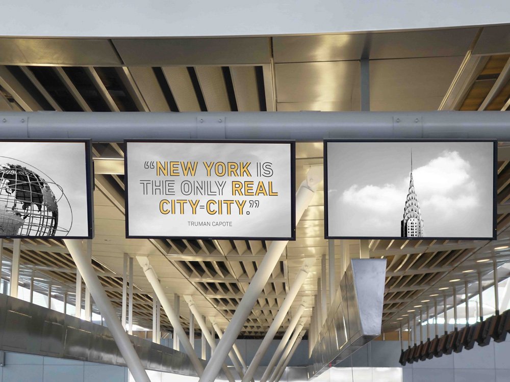
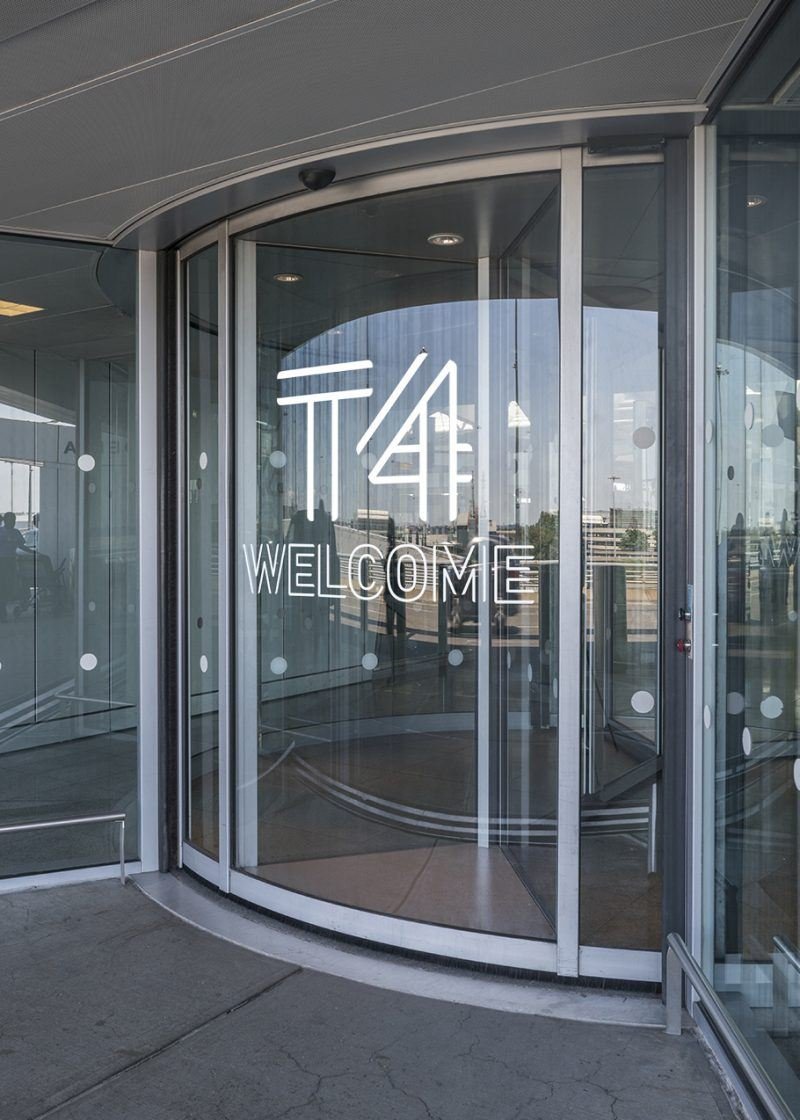
ML: We developed T4’s brand identity system to reflect New York City through a visual language that communicates to its international audience. In order to execute this concept, we designed a custom typeface and focused on the number ‘4’ to extend the meaning of the number and personify the terminal experience being “4 All”—for all people. The visual identity system is light, colorful, modern and electric. We want this to translate into the airport’s atmosphere and help visitors feel the dynamic energy and cultural diversity, which is what makes New York City so unique. We also created a universally relatable ‘personality’ for the airport by posting iconic, NYC-centric quotes to provide visitors a personable and delightful experience.