Color is a language on its own. It plays a pivotal role in the identity of any brand. It expresses value, emotions and meaning and is a vital element in brand recognition. Starting off as a printing company in New Jersey specialized in color charts, The Pantone brand was established in 1962 with an aspiration to create a universal language of colors. Pantone currently positions itself as “the world-renowned authority on color and provider of color systems and leading technology for the selection and accurate communication of color across a variety of industries”. Pantone is the trendsetter of the industry, announcing every December the color of the year. The Berries interviewed Laurie Pressman, Vice President of Pantone Color Institute, to get her insights on the psychology of colors in branding.

BB: Colors play a pivotal role in setting brand personalities, however, in setting brand perceptions, it stirs controversy. Does the psychology of colors differ according to personal tastes, experiences and cultural variations or is their consensus over what each color communicates ? Can the same color communicate different brand perceptions ?
 LP: While there are certainly some common reactions as it relates to consumer color preferences, i.e. red which conveys a message of positivity in most parts of the world, there are also some differences that might be a result of personal taste, experiences, cultural variations and even context.
Context is especially important as it is the context in which a color is placed that might influence whether or not the same color has the ability to communicate different brand perceptions. The brown family is a good example of this. If we took the same brown shade and used this for a chocolate label, it would immediately make sense as there are many shades of chocolate which are brown. Our reactions to a brown used in this way might be delicious and decadent. Now, if we took this same brown shade and placed it into a logo color for soil, it would also make sense as brown is the color of the earth. Our reactions to brown in this context might be earthy and grounded. Same color, different context, which in term elicits different emotional reactions and/or perceptions.
BB: Does color selection for brands impact consumers’ purchasing decisions ? If we’re to allocate percentage of influence elements on our buying decisions, what would be the percentage of colors?
 LP: As color influences 50% – 85% of product purchasing decisions, brand color will certainly play a role in consumer engagement.
BB: What’s the role of colors in setting concrete brand positioning. To what extent, colors are able to be a main distinguisher between rival brands in aggressive-competition markets ?
LP: Color is a brand’s calling card, it is the first thing a consumer sees and the first thing they will connect to. Many brands are recognized instantly because of their distinctive colors.
BB: Can you mention some tips and tricks for newly-launched brands to pick the right color? How can they predict consumer reaction to color selection ?
LP: In selecting a color to represent a brand, it is very important to consider its psychological message and meaning and how the color will broadcast the meaning and image of the company. Things to think about before making a selection could include:
1) What does the brand stand for?
2) What message do you want to convey and how can color help you tell that story?
3) Who is the target market?
4) What is it about the brand, including the color that will seduce the customer to purchase?
5) How can you use color to create a unique look and feel that will stand out on shelf?
6) If international, will color story need to have regional modifications?
Consumer response to color can remain fairly constant, change considerably or simply evolve.
At the Pantone Color Institute we conduct ongoing consumer color preference studies so that we can provide our clients with the most current information.
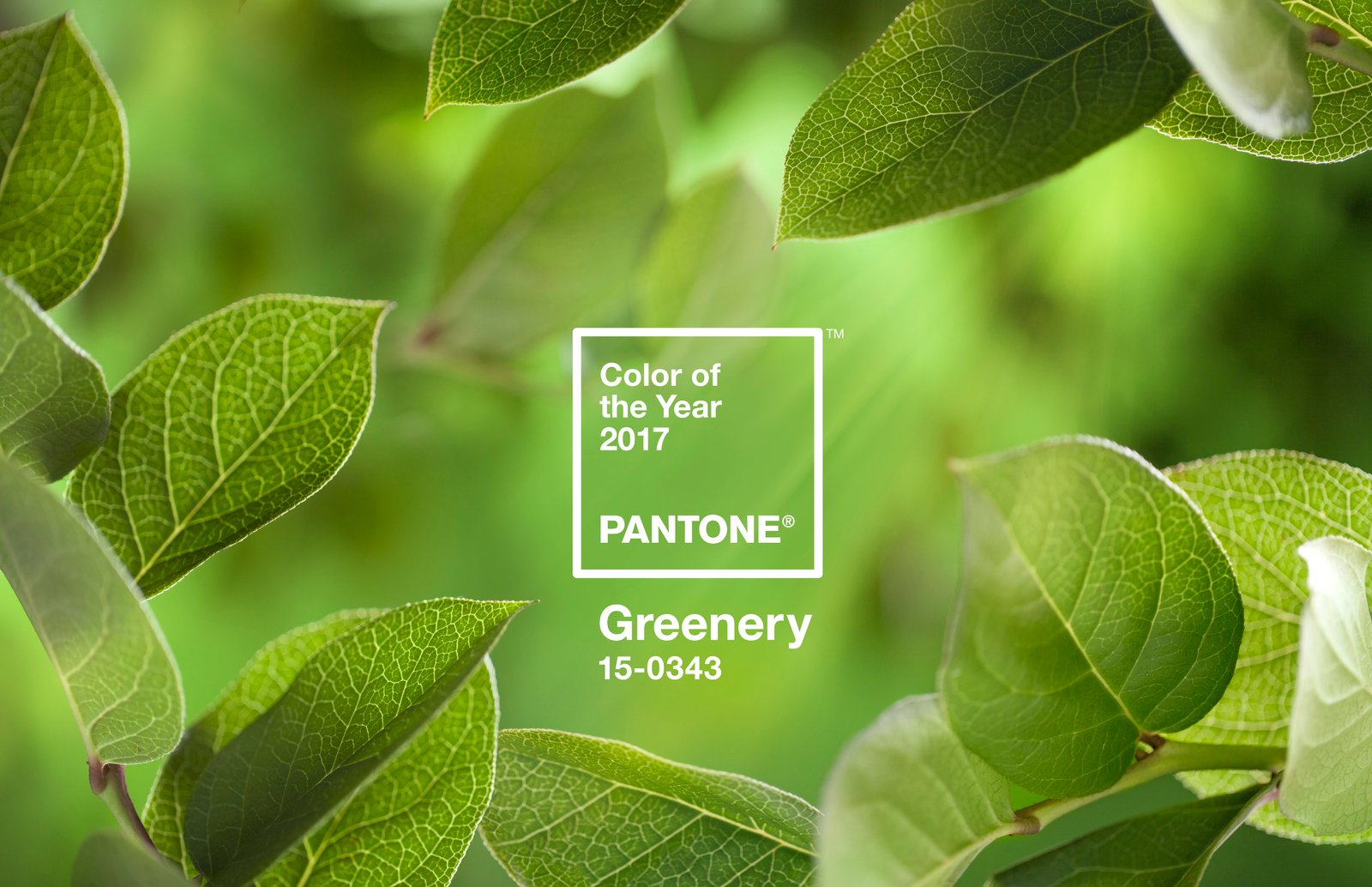
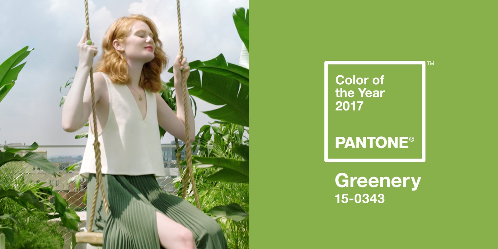
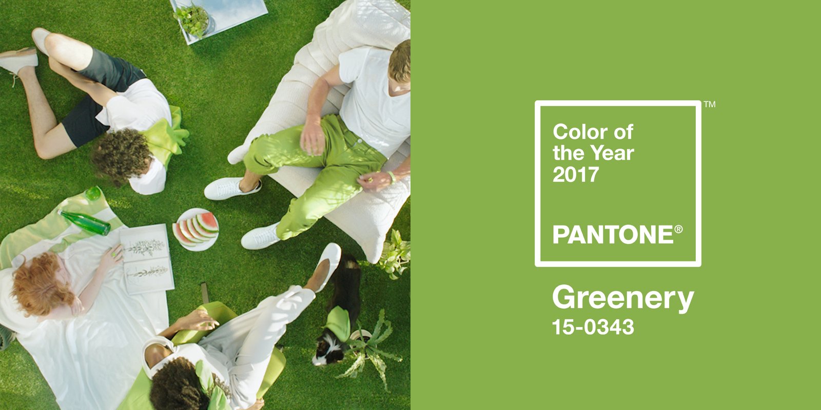
BB: Pantone is know for setting annual trends for brands when it comes to color selection. Can you elaborate on what’s the color of 2017 ? Also, can you shed some lights on your methodology of choosing the color of the year ?
LP: Our Pantone Color of the Year for 2017 is PANTONE 15-0343, Greenery, a shade that is symbolic of new beginnings and expresses a yearning to reinvent. Through its assertive vibrancy and vivid freshness, Greenery gives us the self-assurance to take bold steps and live life on our own terms, redefining what makes us feel successful and happy.
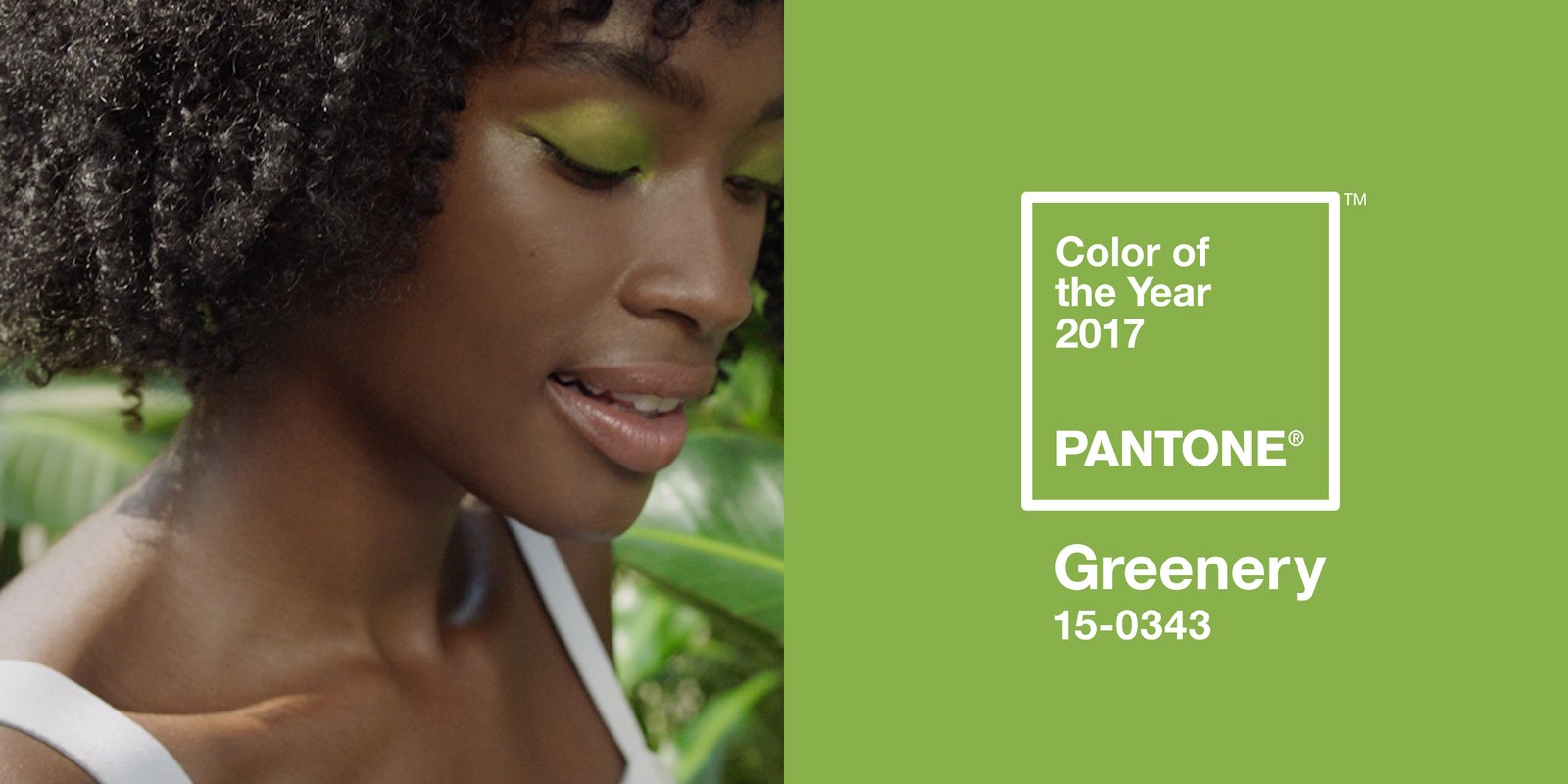
With the current social and political environment becoming increasingly complex and our lives more technology dependent, we are looking for ways to disconnect and replenish. Greenery symbolizes our growing desire to nourish and energize our minds and bodies by reconnecting with nature, one another and a larger purpose.
Illustrative of flourishing foliage and the lushness of the great outdoors, the fortifying attributes of Greenery signals to us to take a deep breath, oxygenate and reinvigorate, leaving us feeling refreshed and revitalized.
Symbolic of rebirth, regrowth, regeneration and the renewal of life as the color of vegetation that breaks through the hard wintry ground we look to Greenery as a reassuring and life affirming color that signifies the first sign of spring.
Just as we see the zesty yellow green hue bursting through the soil, Pantone Greenery gives us confidence to pursue our personal passions and express, explore and experiment.
To arrive at the selection each year, our team at the Pantone Color Institute are out there actively searching for general lifestyle color trends and new color influences for our forecast products, and at the same time are also on the lookout for the color that they see as ascending and seems to be building in importance across all areas of design, the one color that is really pushing through and the single shade we think has the ability to communicate the color message that best reflects what is taking place in our culture at a particular moment in time.
Areas they look at can include the entertainment industry and films in production, traveling art collections and hot new artists, fashion as well as all areas of design, popular travel destinations, as well as new lifestyles, playstyles, and socio-economic conditions. Influences may also stem from new technologies, materials, textures and effects that impact color, relevant social media platforms and even up-coming sporting events that capture world-wide attention.
The emotional aspect of color is such a large aspect of our decision making as we want to ensure that the colors we select are reflective of the collective mindset. With color and context so intertwined there really are reasons why a color family or individual color comes into prominence when it does, and for the most part the popularity of a color is symbolic of the age we are living in. The color we select to be our Pantone Color of the Year is a color we see crossing all areas of design that serves as an expression of a mood and an attitude on the part of the consumers, a color that will resonate around the world, a color that reflects what people are looking for, what they feel they need that color can help to answer.
BB: Are there any clear-cut guidelines for choosing a brand’s color palette ? Are some colors directly related to certain industries? Or it remains very dependent and subjective to each brand ?
LP: There are no clear cut guidelines for choosing a brand’s color palette. Yes, there are some colors that might reflect certain industries but that doesn’t mean that is where you want your brand to be and what you want your brand to look like. As color is an expression of who a brand is, color choice will depend upon the brand DNA. The goal is to have color convey to the consumer who you are, what you stand for and the unique qualities and brand promise.