Reviewed By
David Cano, Creative Director at Interbrand Madrid
Designing an airline is probably one of the biggest projects that you can do in branding nowadays. Designing it for a flagship company (as Gulf Air is for Bahrein) and in the Middle East has also a strong social and cultural component that has to consider it as a country asset, compulsory linking it to the previous identity. An evolution more than a revolution.
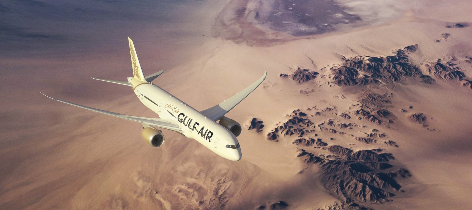
The work of Saffron, updating it to reflect a new strategy, a new relationship proposal with their audiences and rejuvenating the brand, is very correct. The brand idea “Smart with heart” is appropriate, but we’ll see how does GA implement it, as it’s also quite generic. Without the appropriate attention to detail and subtlety, it could be linked to any other airline (or company) as well.
![]()
It’s in the graphic resources developed where the specific differentiation can be perceived. Nice visual links among elements, brilliant typeface design, nice (and differentiating) illustrations and color palette… although the redesign of the symbol leaves me (as a designer) wanting to simplify it, particularly in the aircraft application. It looks as if the synthesis exercise needed was left half way, but knowing Saffron, I’m pretty sure that the client – every design project ownership is shared between the brand consultancy AND the client – played a role here.