
Any time a brand revamps its visual identity, the first question we designers should ask is not whether we find the new look appealing – but rather why the changes were made in the first place. It’s usually a good idea to make a visual statement that signals change if the brand is repositioning itself or introducing new products. So before we evaluate the new corporate design for Gulf Air, we must first examine the general framework and conditions under which the brand has been operating.
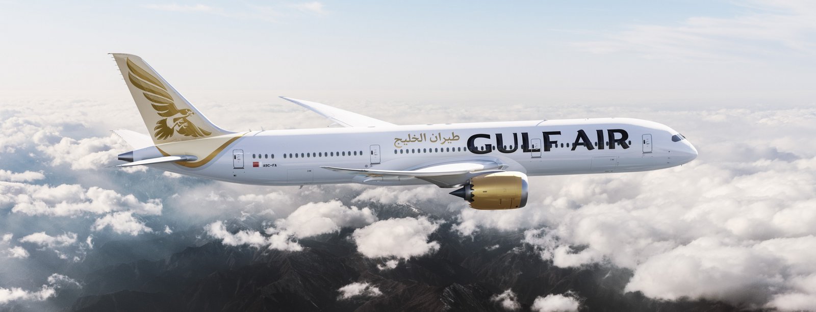
The history of Gulf Air dates back to the year 1950, making it without a doubt the most venerable airline in the Arab world. For many years it was the airline of Bahrain, Qatar, Abu Dhabi and Oman, but as some of these countries began selling off their stake in the joint venture and establishing their own national airlines in the 1990s, Gulf Air struggled for a number of reasons. For one thing, the company had to redefine its role, and is now the flag carrier of Bahrain. Of course, the withdrawal of Qatar, Abu Dhabi and Oman, as well as the competition from their newly established airlines, created considerable turbulence in the market. After extensive restructuring, the company is now ready to introduce new Boeing 787s this year to expand and rejuvenate its long-haul fleet. This is a milestone for Gulf Air – and an opportunity to revamp its corporate design.
The time is right for the change, as it signals the introduction of new a product. That is logical and correct. But Gulf Air is not undertaking a radical redefinition of its identity, opting instead to retain its name and corporate colors as well as the familiar golden falcon. This is also logical and correct, because Gulf Air is after all the “original” airline of the region. Therefore the brand can reference many years of history and tradition – unlike its new competitors. The new corporate design, which was developed by global brand consultancy Saffron, exploits and polishes this heritage to create a radiant new look.
![]()
The corporate design package developed by Saffron is consistent and coherent. It comprises basic elements such as the logo, color scheme and corporate typeface as well as pictograms, the illustration style for the in-flight magazine and even the decorative pattern used in the cabin, which also appears on the company’s letterhead. All of these elements include design references to the brand and its history, but reinterpret these impulses to create a “modern retro” impression. This look calls to mind the luxurious ways of the Golden Age of Air Travel – especially when it is applied to illustrations such as those in the marvelously designed in-flight magazine.

Whereas Lufthansa aims to convey an impression of premium quality through minimalist simplicity, Gulf Air has chosen to employ more ornamental design that is nearly the complete opposite. I find the new typeface, with its hand-written appearance and characteristic shading, a particularly admirable example of this approach. The result is a distinctive look that harmoniously unites the Latin and Arabic alphabets. I also like the newly designed falcon, which exhibits strength and a powerful, open beak that seems ready to snap shut on its prey. With its hatching, the logo design harks back to the shading in the corporate typeface. And the proportions are optimally adjusted to the tail fin of the airplanes, where it will soon be prominently displayed.
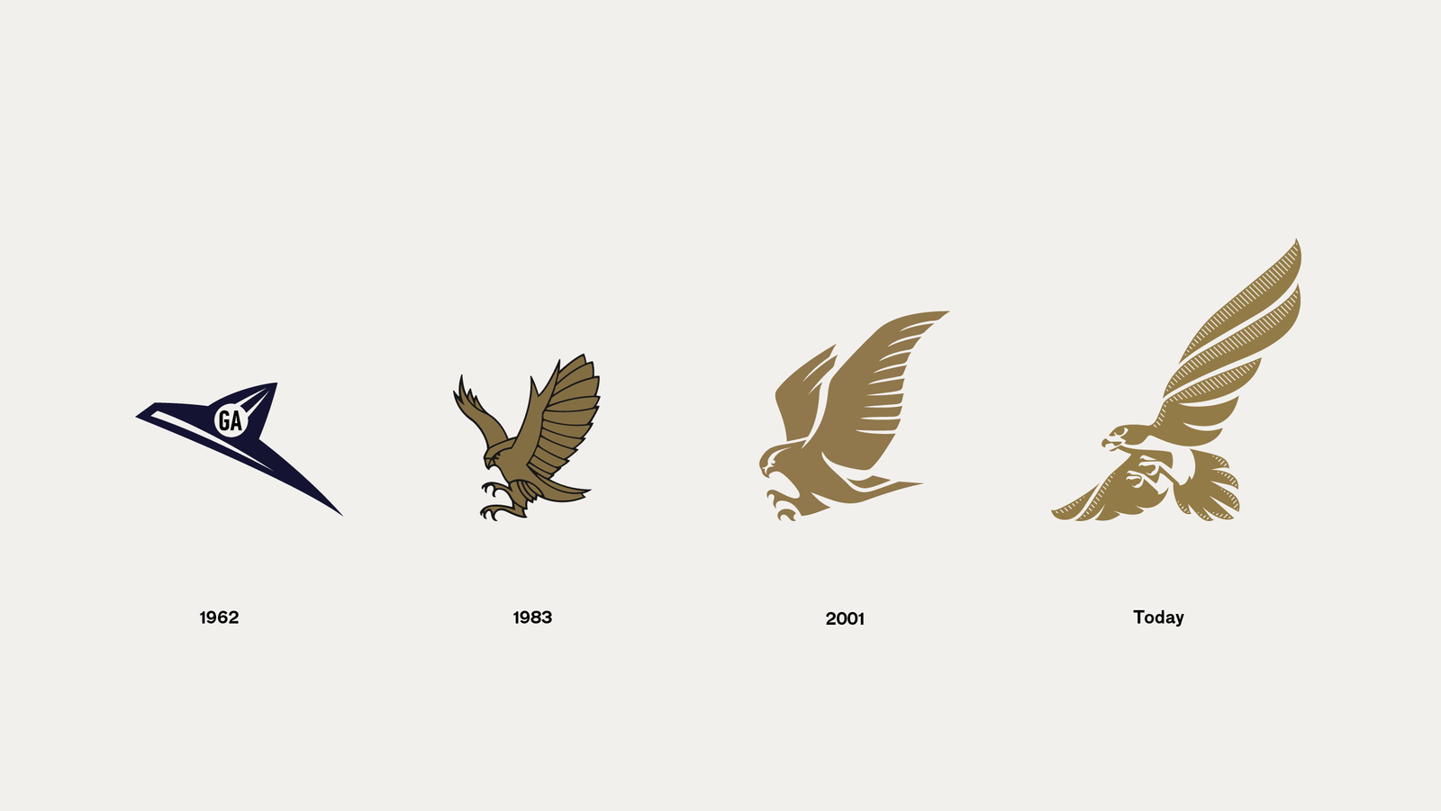
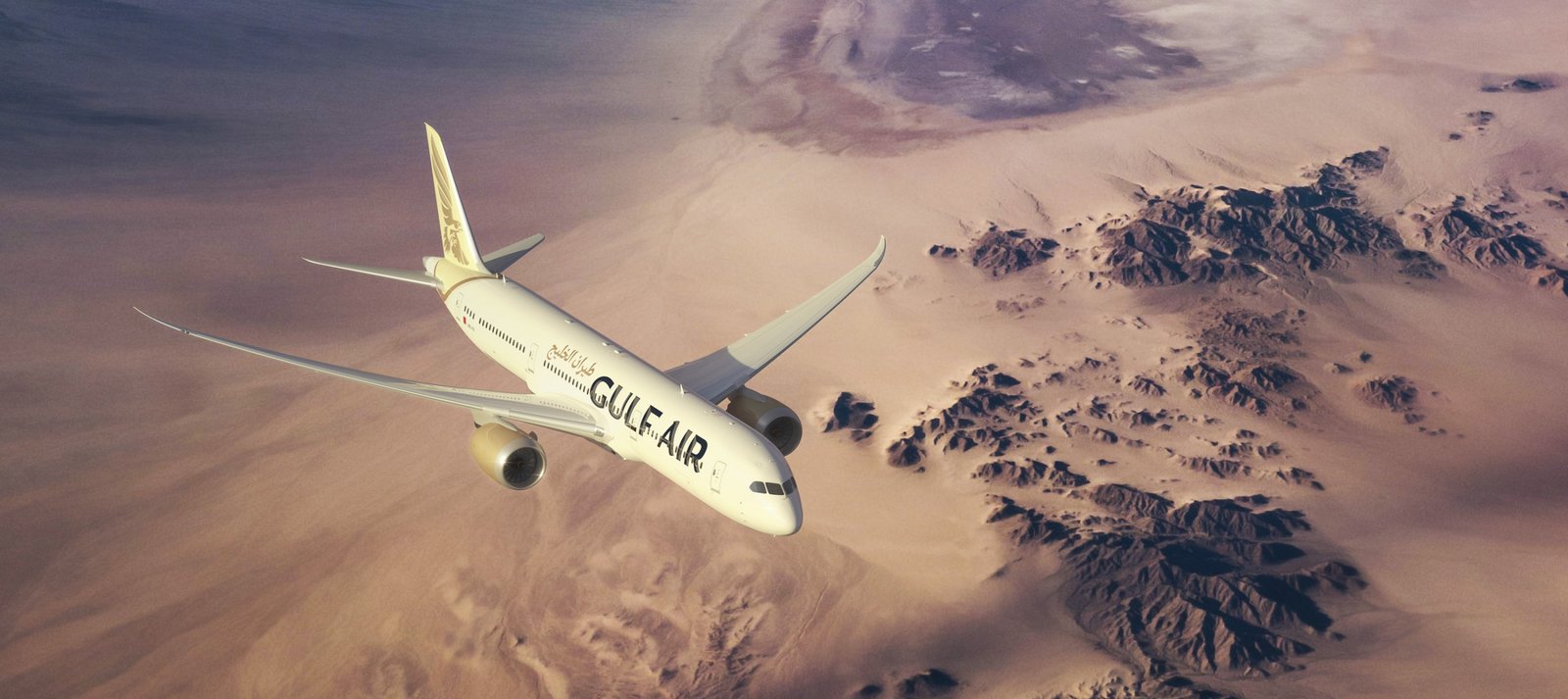
So is everything perfect? Not entirely. Although the new falcon drawing is attractive, the devil is in the details: The light-and-shadow work, particularly in the bird’s claws, and the high degree of detail ultimately reduce the logo’s long-distance impact. I would recommend an outline version of the logo for use against dark backgrounds; this would make it possible to avoid reversed shadows in diverse media with varying degrees of contrast. The current approach for the tail fin – a golden falcon against a light-beige background – is also a bit too low in contrast for my taste. As a result the falcon’s long-distance impact is diminished; an outline version against a darker background would surely produce better results. But all in all, my verdict is that this is an accomplished, coherent redesign effort. And the right step to unite the brand’s history with its new positioning.
Ulrich Aldinger
Ulrich Aldinger is Creative Director of the Peter Schmidt Group, Germany's most successful branding agency and part of the BBDO Group.