Established in 1992, the Premier League is reportedly the most watched football league in the world. Since 2001, Barclays-the British multinational bank-has been the title sponsor of the Premier League, a sponsorship that expires this season. Based on which, the Premier League will move away from having title sponsors in the 2016 – 17 season. With this strategic shift came the decision to rebrand the Premier League iconic identity. The Berries interviewed Paul Stafford, Co-Founder and CEO of Design Studio – The Design Agency behind the facelift- to give us a sneak peak on the rebranding of the legendary football league.
BB: Since 2001, Barclays, the British multinational banking and financial services company, has been the title sponsor of the Premier League’s seasons, officially titled as Barclays Premier League. The sponsorship will expire this season, thus ending title sponsorship. Can this significant update in the brand strategy be considered as the main driver behind rebranding the Premier League ?
 PS: Yes, this was a significant driver behind the rebrand. The Premier League was to operate without a title sponsor for the first time since its inaugural 1992/93 season, providing a fantastic opportunity to position the Premier League brand and its values front and centre; building a better understanding and appreciation for everything it does, both off and on the pitch.
BB: How can creatives revamp the identity of a brand like the premier league giving it a contemporary, bold and vibrant look and feel with preserving its heritage and legacy ?
PS: Whilst there is often a need to update a brand so it works well in contemporary digital formats, it’s always important to utilize the existing equity and heritage of a brand where possible. We do this by immersing ourselves in each brand we work with, we carry out research, set up workshops, stakeholder interviews, audience (fan) focus groups – to unearth what its users care about. You have to find the most amazing stories within the company and then the most compelling way of telling those stories.
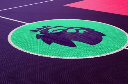
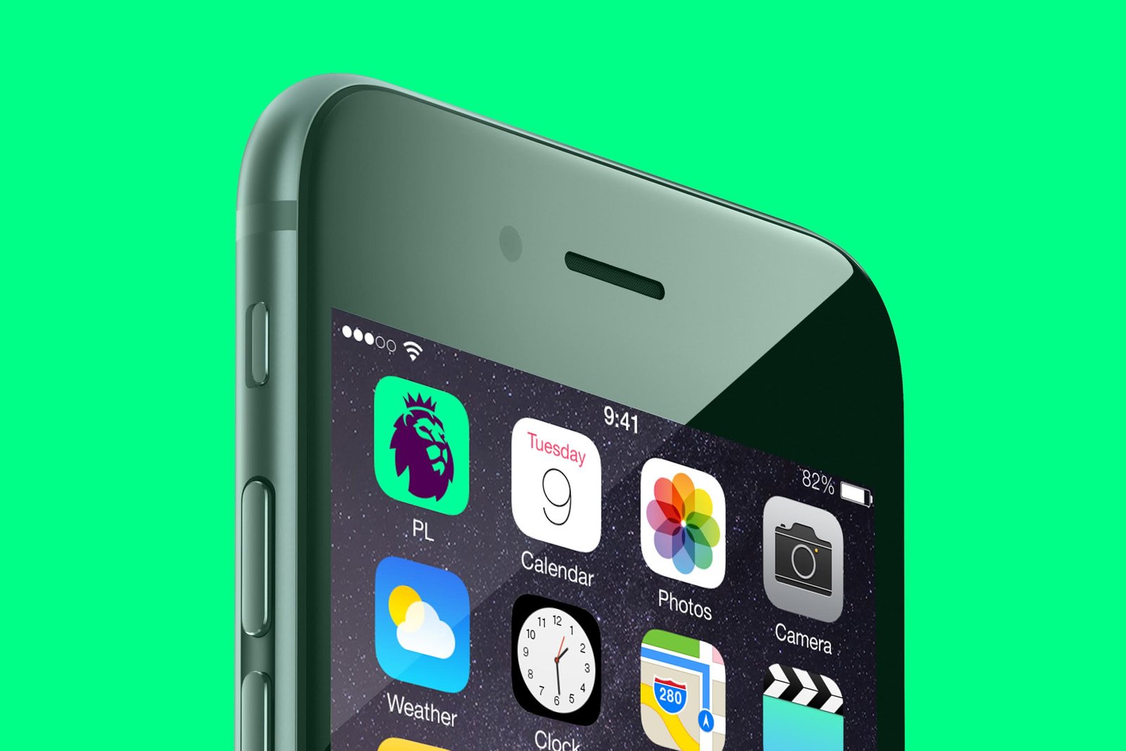
BB: The league has had a lion full body with a crown standing on a red ball since it’s establishment, the new icon reflects the minimalist design with only the elements of the crown and the face of the lion remain. Can you shed some light on the rationale behind the icon revamp?
PS: We conducted a ton of research with Premier League fans in the initial stages, and 90% of the fans we spoke to told us how important it was to keep the lion. We even used eye tracking software to find out which parts of the old logo people were drawn to. The focus was the lion’s head, so we did hundreds of iterations of what this could look like, changing the direction of his gaze to a side on slant and tilted upwards so he looks proud but not arrogant, and forward facing but still engaging. The new lion is borne from the rich heritage of the Premier League and the trophy, retaining the equity that the Premier League has built while creating a new symbol which is unmistakable, from the app icon to football shirt badge.

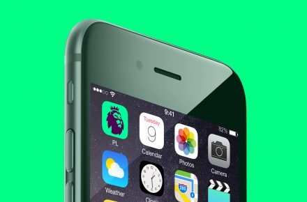
BB: With the rise of the digital era , do you consider this updated brand identity a more ‘digital-friendly’ identity ?
PS: A big consideration of the brand was that it had to work across multiple touch points. On digital at a small size, and versatile enough to work for broadcast, but these were technical considerations that were the tip of the iceberg. The biggest thing for us was to amplify the idea of ‘We all make it’. The idea that everyone is part of the Premier League. It has global appeal, it has amazing match days, incredible sport, but it also has a power to do good and the bigger portion of the rebrand was to ensure the Premier League had a platform through which to share these rich stories with their global audience.
BB: There is currently a strong wave of rebranding in the sports industry aiming to enhance sports as entertainment brands that helps connect and engage audiences. Can you tell us how the new identity of the Premier League will help create a more engaging experience to the audience?
PS: The Premier League is a global brand phenomenon, with an audience of 3.3 billion in-home viewers. We knew from the start the new identity needed to have the stretch and flex to appeal to all audiences, vying for attention not just with other sports brands but also against the likes of Apple, Twitter and Netflix. It’s these brands that are part of the world people are constantly interacting with, even on match days at the games. So by looking at the visual cues of these modern brands, and what they are doing, enabled us to position the Premier League to sit much more in this space.
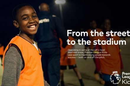
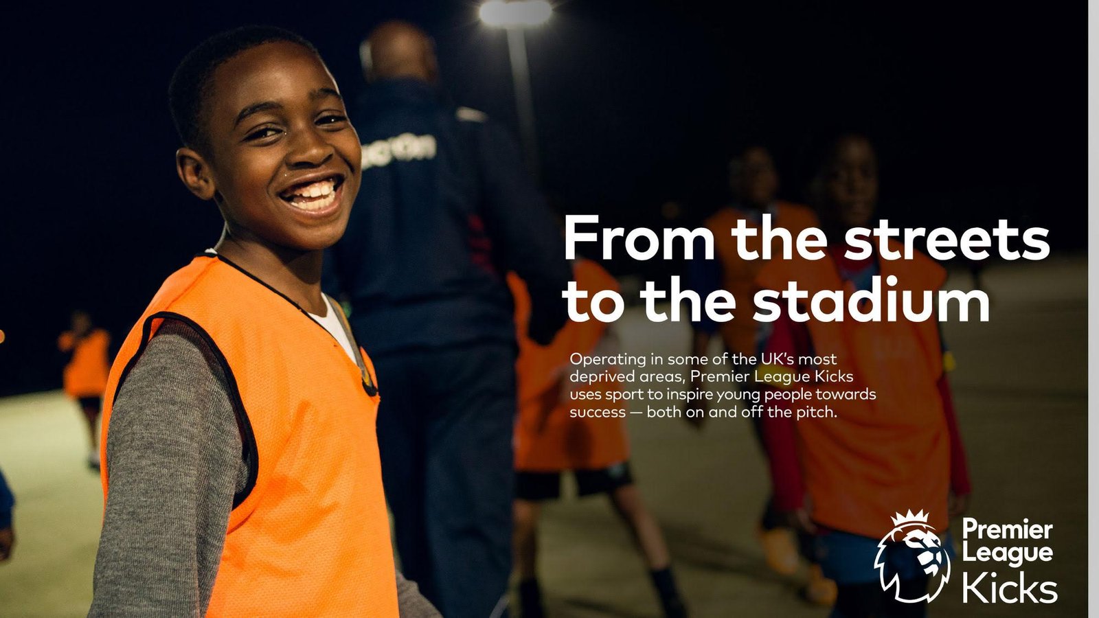
Ultimately, to connect and engage with the Premier League audience was about giving the league a platform to reveal and champion the human stories behind the games and beyond. As Richard Masters, the Premier League Managing Director, said, ‘it’s not the amount of pitches built, it’s the lives changed on them’. To hero the human stories we turned the camera away from the pitch to the stands, and to the communities where lives are being changed by the actions of the Premier League.
![]()
BB: Does rebranding the Premier League contribute to elevating the overall nation branding of Britain ? Please elaborate
PS: We’ve created an identity that will live and evolve for years to come, turning a renowned company into a loved brand. Just over one year later and it’s hard to remember a time before the new Premier League – it’s grown into a benchmark for contemporary global brands across industries and beyond sports. It’s great for a British brand to be at the forefront of its industry, and able to tell its rich stories in the best possible way.